Using CSS Grid Today Scott Gruber Los Angeles, November 2018
Slide 1
Slide 2
History of Web Layouts • • • • Table Floats Flexbox CSS Grid
Slide 3
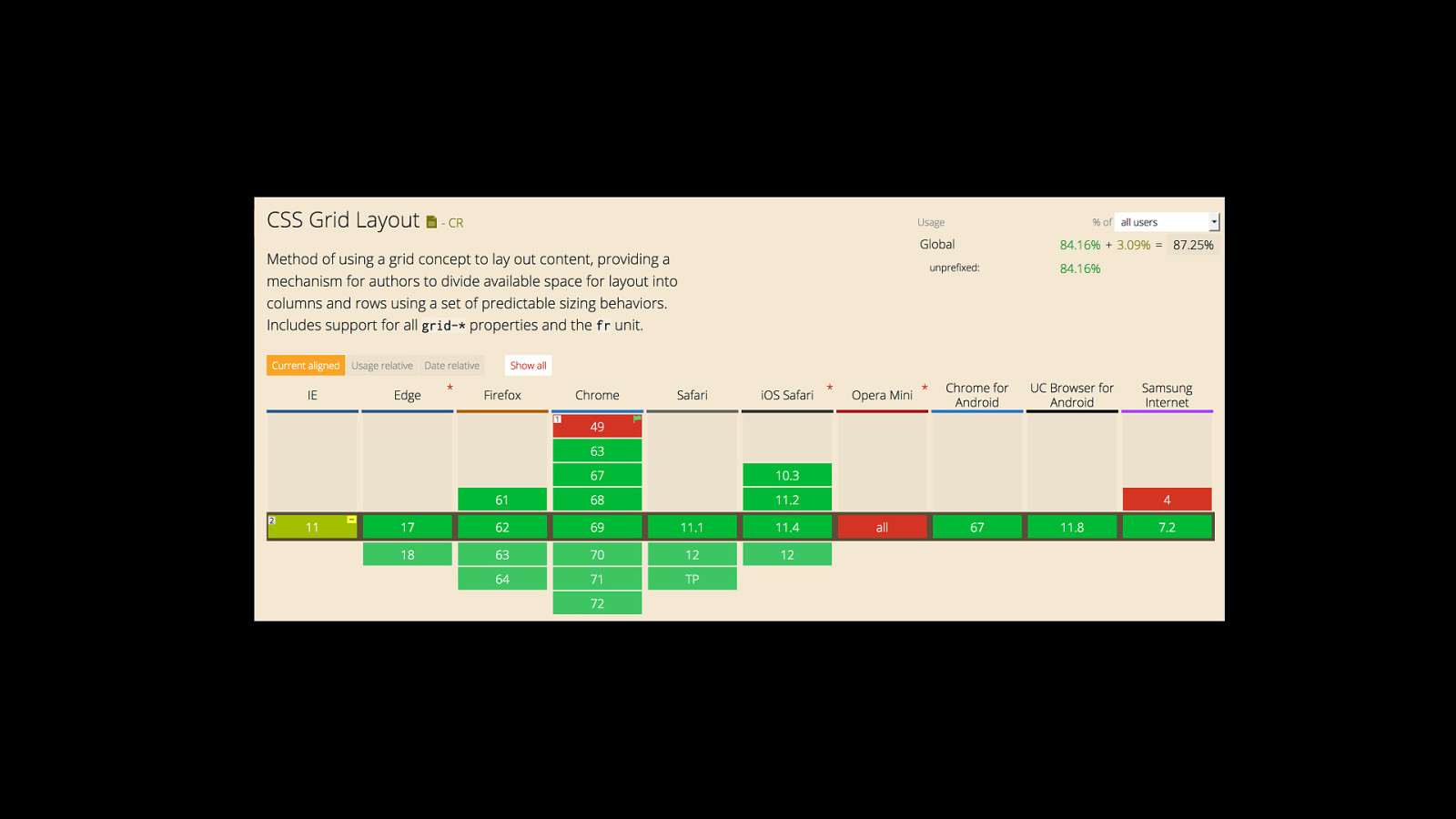
CSS Grid Layout shipped in production browsers 2017.
Slide 4
Slide 5
Slide 6
CSS Grid Layout brings a twodimensional grid system to the Web.
Slide 7
Overview • • • • • • • Grid terminology Grid display Creating the grid template Naming grid areas Placing grid items Implicit grid behavior Grid spacing and alignment
Slide 8
“A grid is an intersecting set of horizontal and vertical lines”
Slide 9
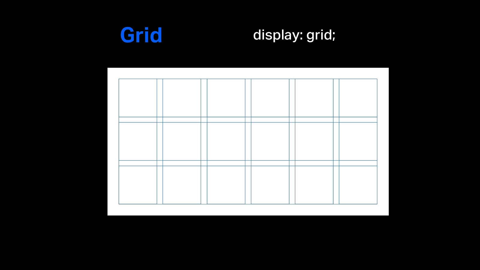
Grid display: grid;
Slide 10
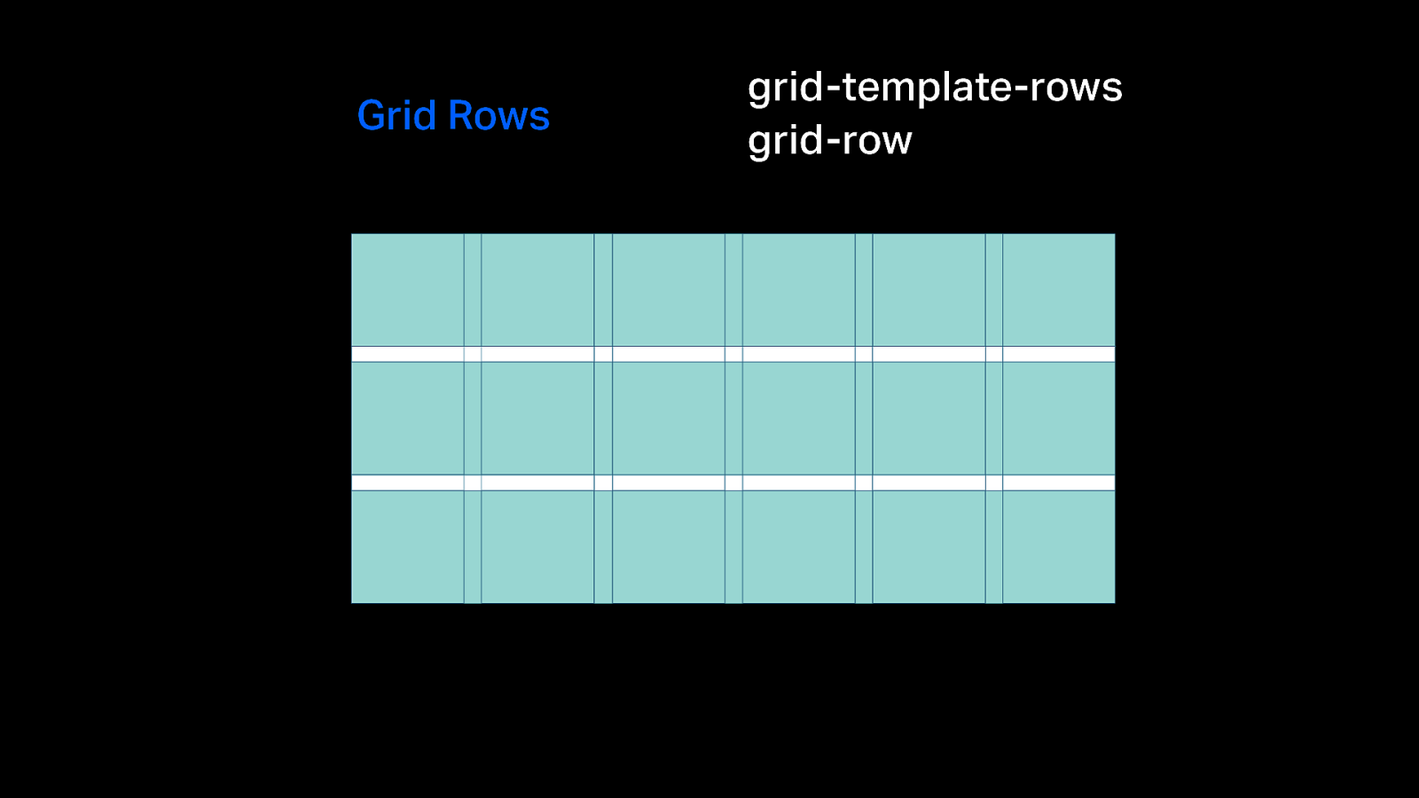
Grid Rows grid-template-rows grid-row
Slide 11
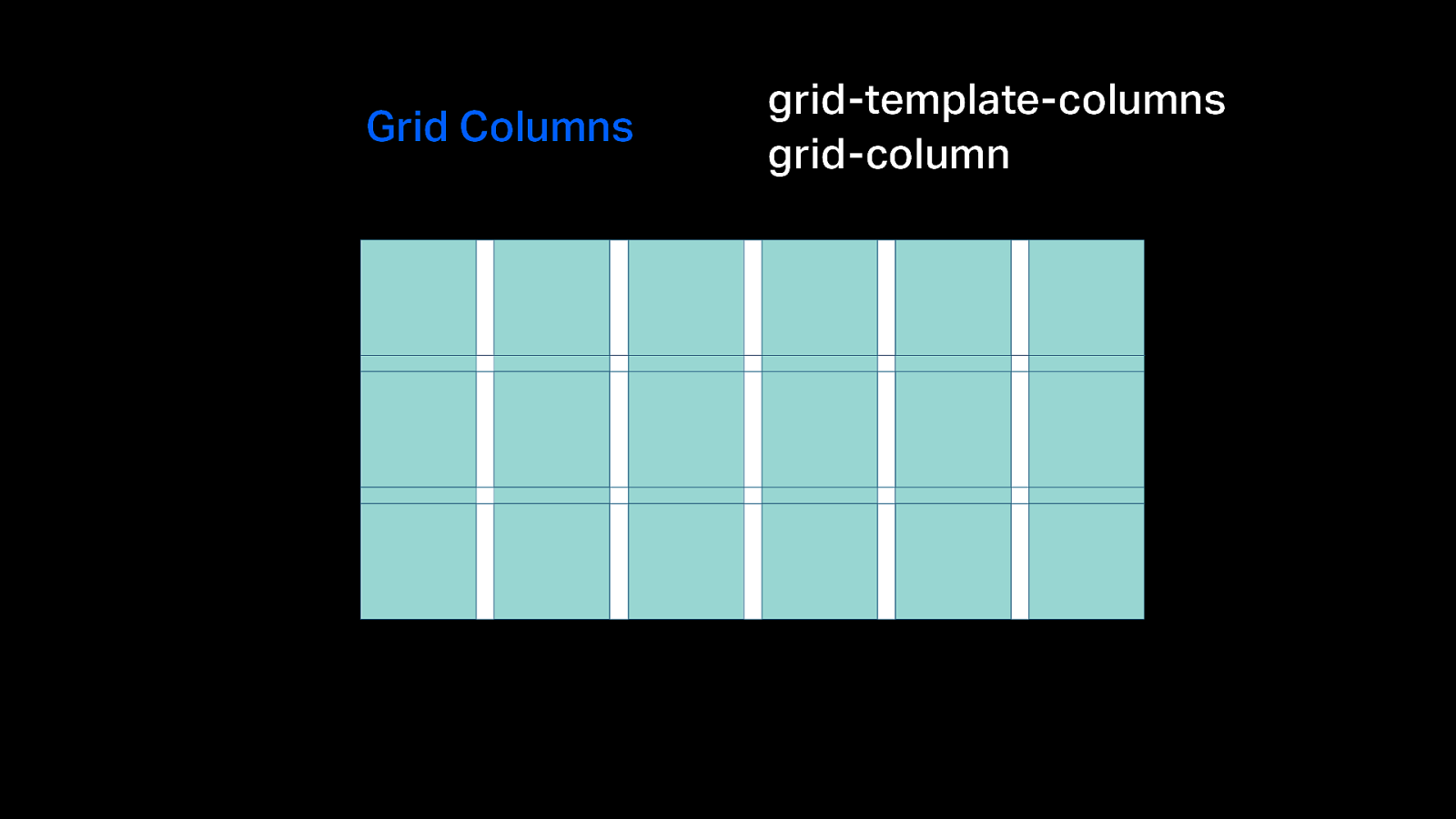
Grid Columns grid-template-columns grid-column
Slide 12
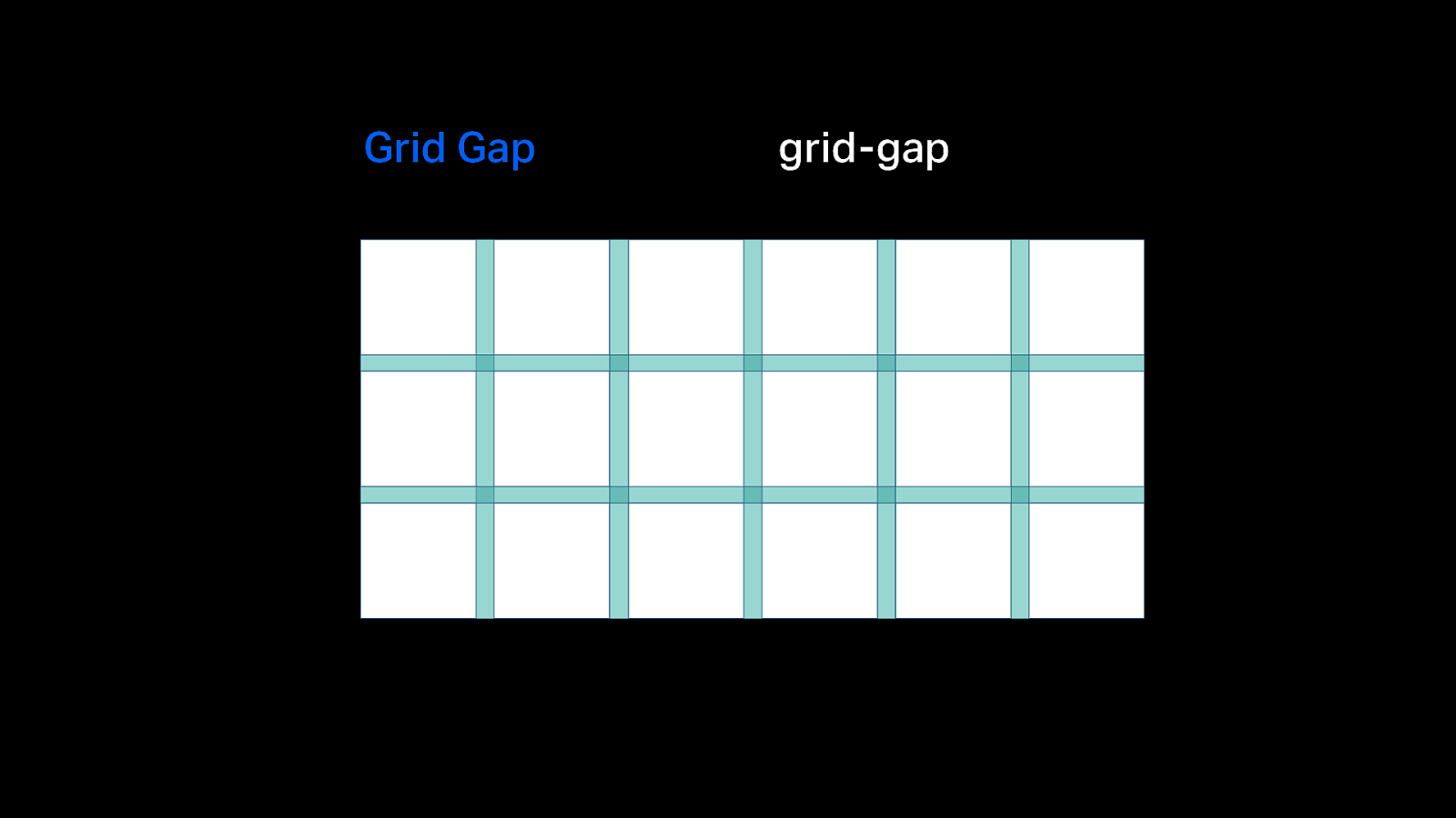
Grid Gap grid-gap
Slide 13
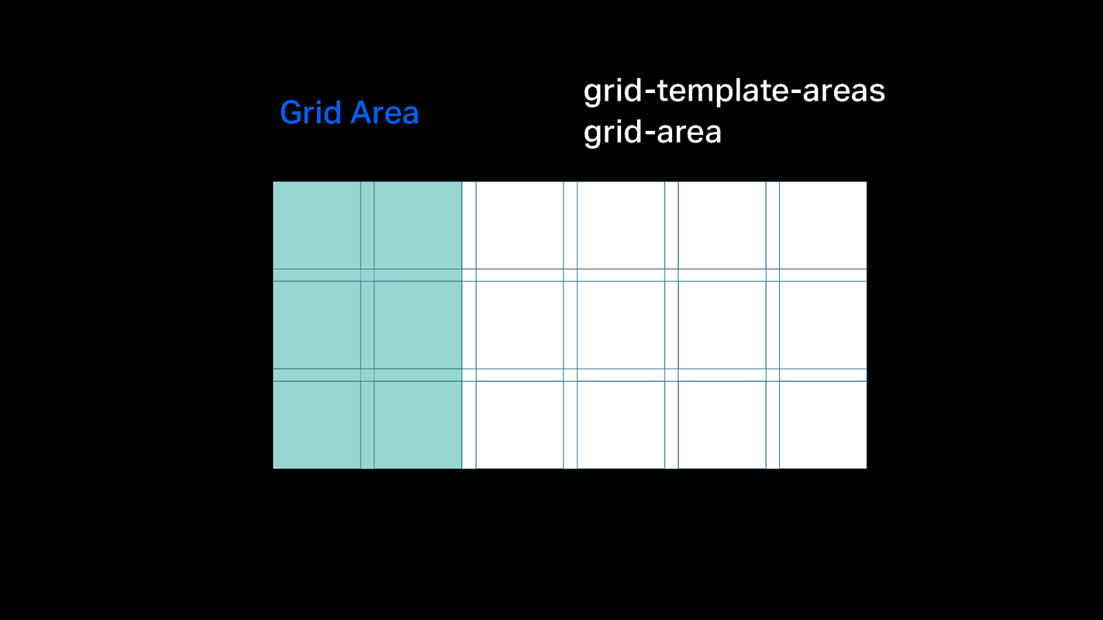
Grid Area grid-template-areas grid-area
Slide 14
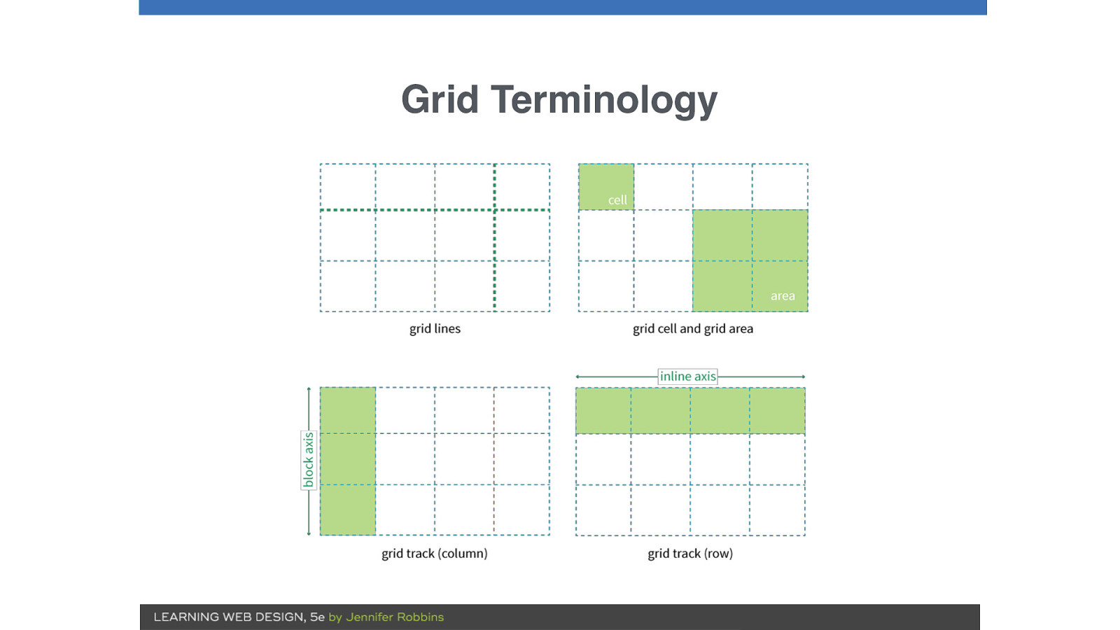
Grid Terminology
Slide 15
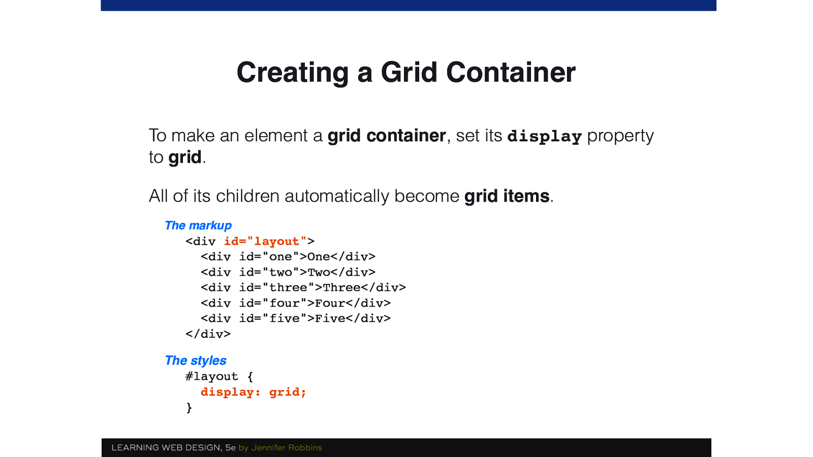
Creating a Grid Container To make an element a grid container, set its display property to grid. All of its children automatically become grid items. The markup
<div id="layout"> <div id="one">One</div> <div id="two">Two</div> <div id="three">Three</div> <div id="four">Four</div> <div id="five">Five</div> </div> The styles #layout { display: grid; }Slide 16
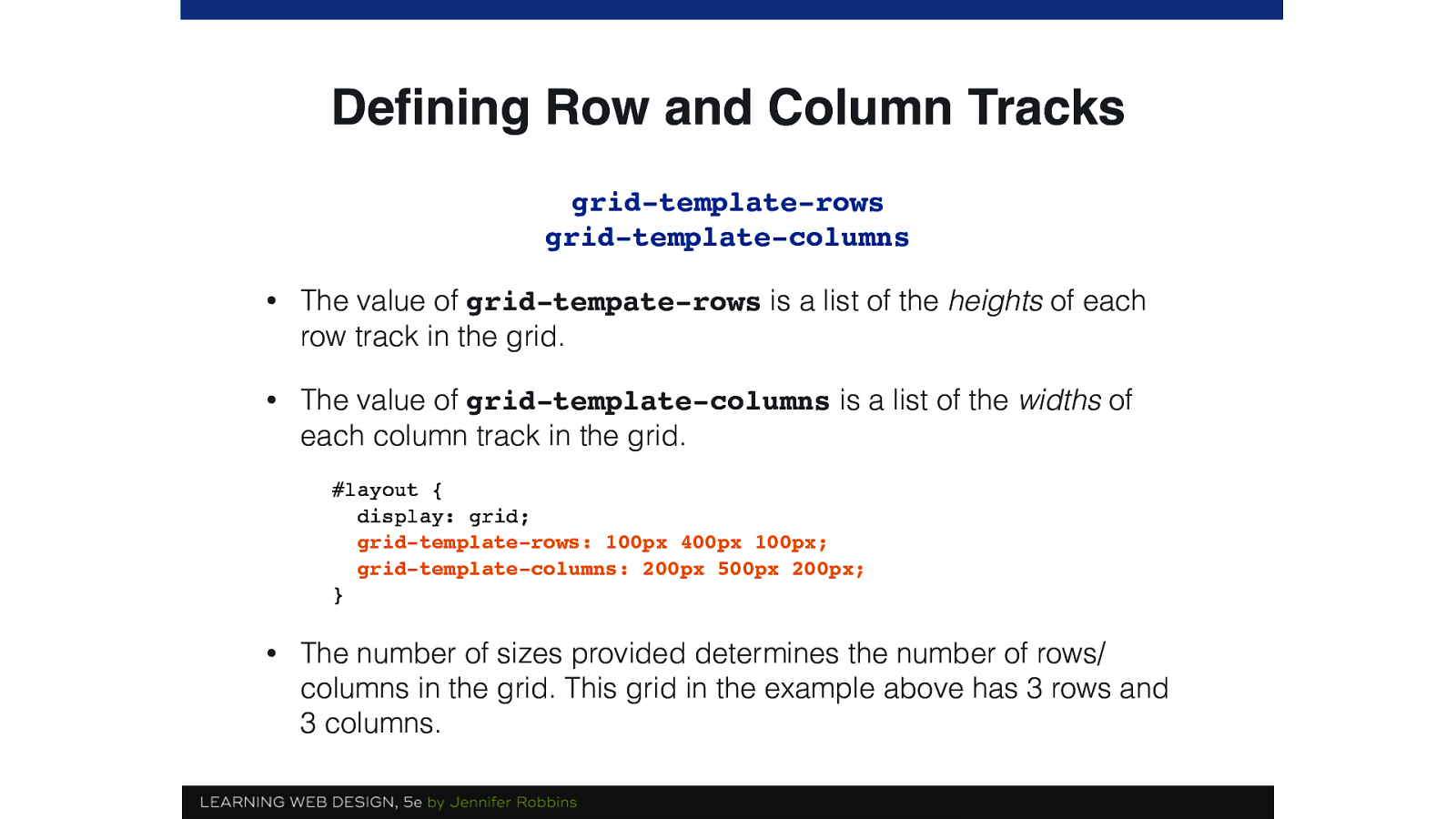
Defining Row and Column Tracks grid-template-rows grid-template-columns • The value of grid-tempate-rows is a list of the heights of each row track in the grid. • The value of grid-template-columns is a list of the widths of each column track in the grid. #layout { display: grid; grid-template-rows: 100px 400px 100px; grid-template-columns: 200px 500px 200px; } • The number of sizes provided determines the number of rows/ columns in the grid. This grid in the example above has 3 rows and 3 columns.
Slide 17
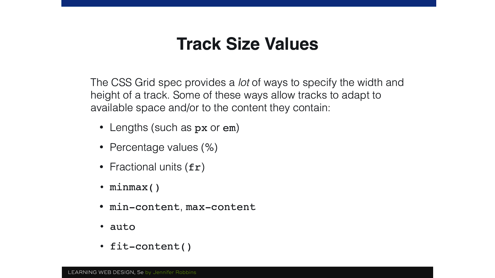
Track Size Values The CSS Grid spec provides a lot of ways to specify the width and height of a track. Some of these ways allow tracks to adapt to available space and/or to the content they contain: • Lengths (such as px or em) • Percentage values (%) • Fractional units (fr) • minmax() • min-content, max-content • auto • fit-content()
Slide 18
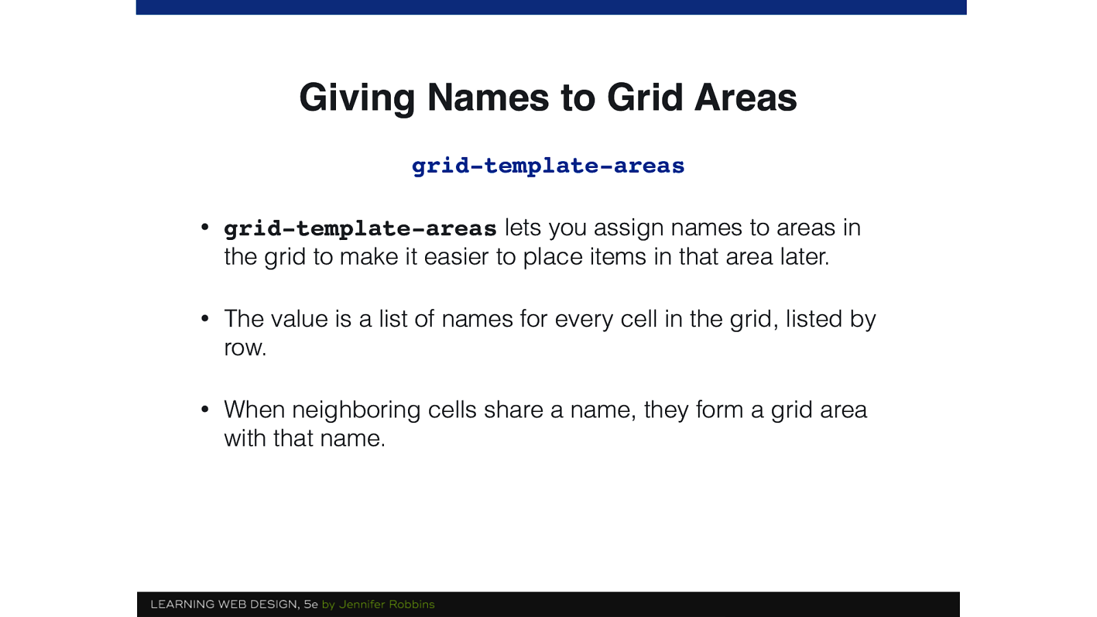
Giving Names to Grid Areas grid-template-areas • grid-template-areas lets you assign names to areas in the grid to make it easier to place items in that area later. • The value is a list of names for every cell in the grid, listed by row. • When neighboring cells share a name, they form a grid area with that name.
Slide 19
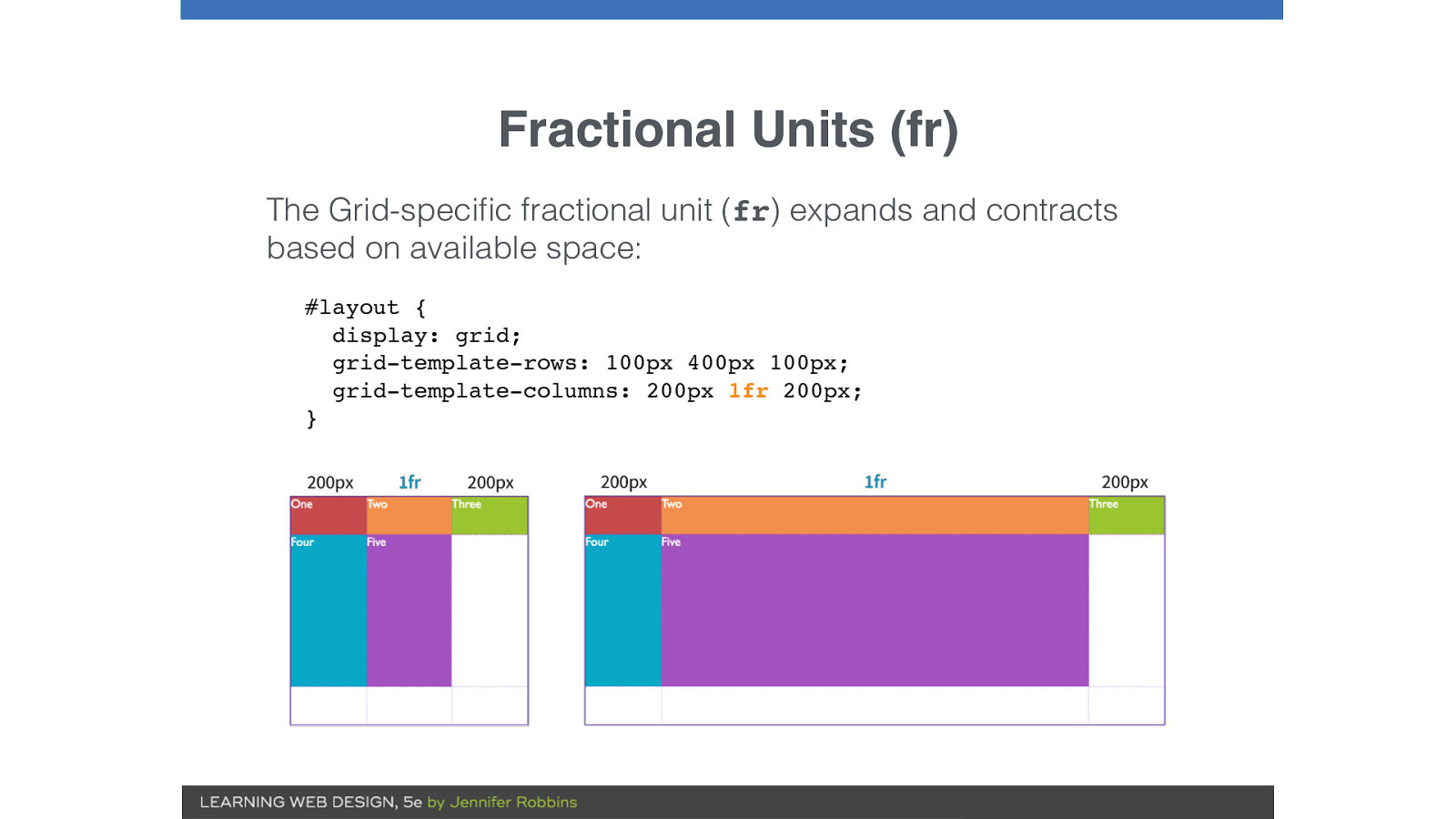
Fractional Units (fr) The Grid-specific fractional unit (fr) expands and contracts based on available space: #layout { display: grid; grid-template-rows: 100px 400px 100px; grid-template-columns: 200px 1fr 200px; }
Slide 20
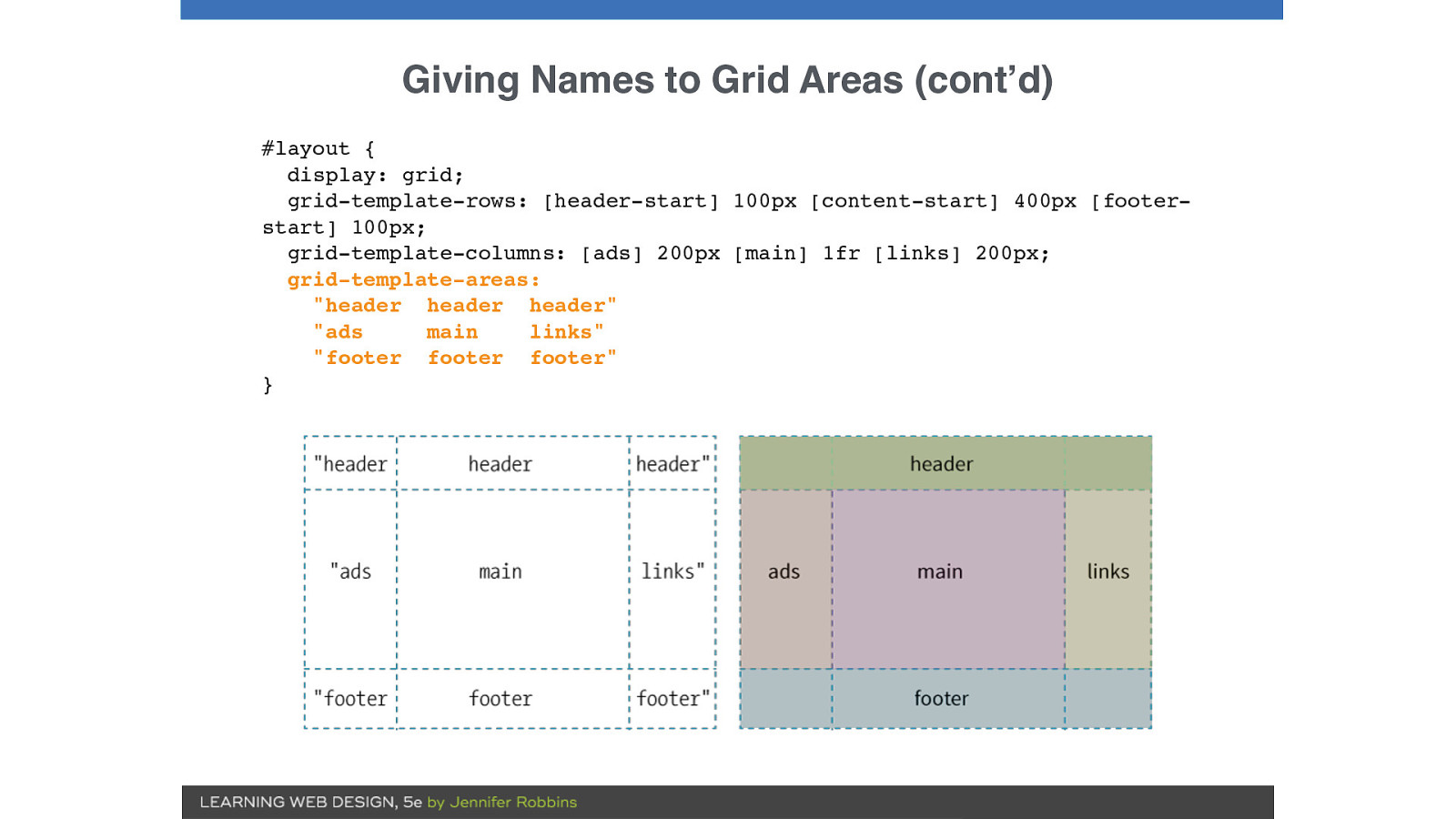
Giving Names to Grid Areas (cont’d) #layout { display: grid; grid-template-rows: [header-start] 100px [content-start] 400px [footerstart] 100px; grid-template-columns: [ads] 200px [main] 1fr [links] 200px; grid-template-areas: "header header header" "ads main links" "footer footer footer" }
Slide 21

Simple Page
Slide 22
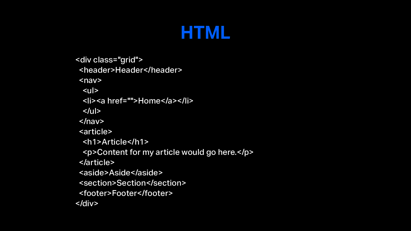
HTML <div class="grid"> <header>Header</header> <nav> <ul> <li><a href="">Home</a></li> </ul> </nav> <article> <h1>Article</h1> <p>Content for my article would go here.</p> </article> <aside>Aside</aside> <section>Section</section> <footer>Footer</footer> </div>
Slide 23
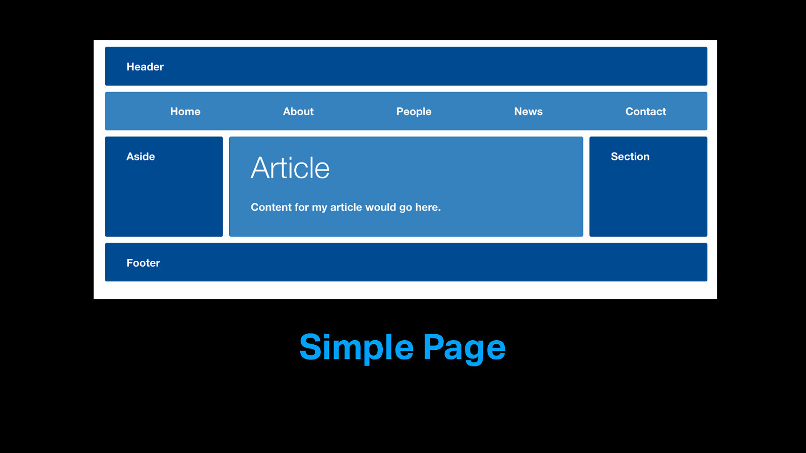
Simple Page
Slide 24
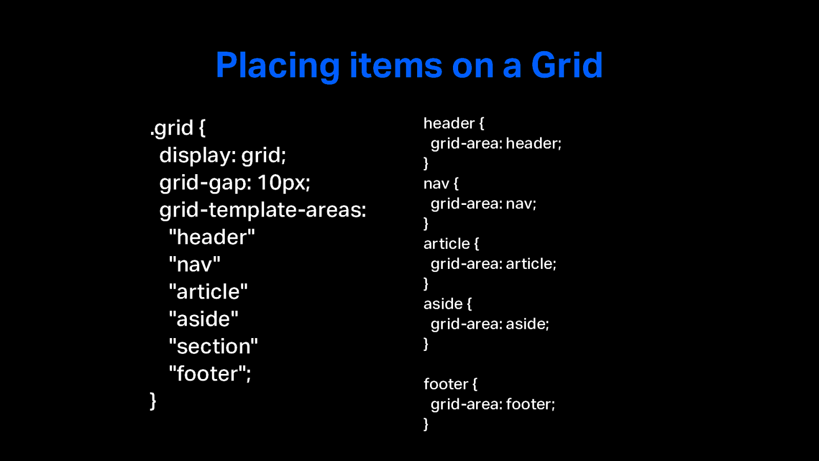
Placing items on a Grid .grid { display: grid; grid-gap: 10px; grid-template-areas: "header" "nav" "article" "aside" "section" "footer"; } header { grid-area: header; } nav { grid-area: nav; } article { grid-area: article; } aside { grid-area: aside; } footer { grid-area: footer; }
Slide 25
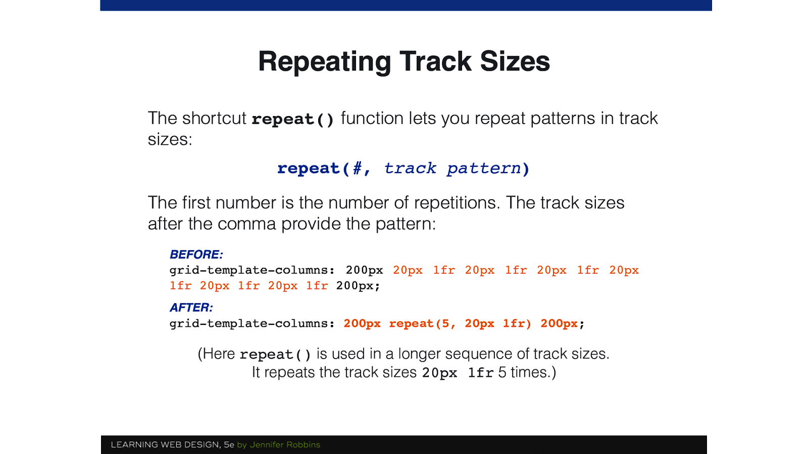
Repeating Track Sizes The shortcut repeat() function lets you repeat patterns in track sizes: repeat(#, track pattern) The first number is the number of repetitions. The track sizes after the comma provide the pattern: BEFORE: grid-template-columns: 200px 20px 1fr 20px 1fr 20px 1fr 20px 1fr 20px 1fr 20px 1fr 200px; AFTER: grid-template-columns: 200px repeat(5, 20px 1fr) 200px; (Here repeat() is used in a longer sequence of track sizes. It repeats the track sizes 20px 1fr 5 times.)
Slide 26
Feature Queries The @supports CSS at-rule lets you specify declarations that depend on a browser's support for one or more specific CSS features. This is called a feature query.
Slide 27
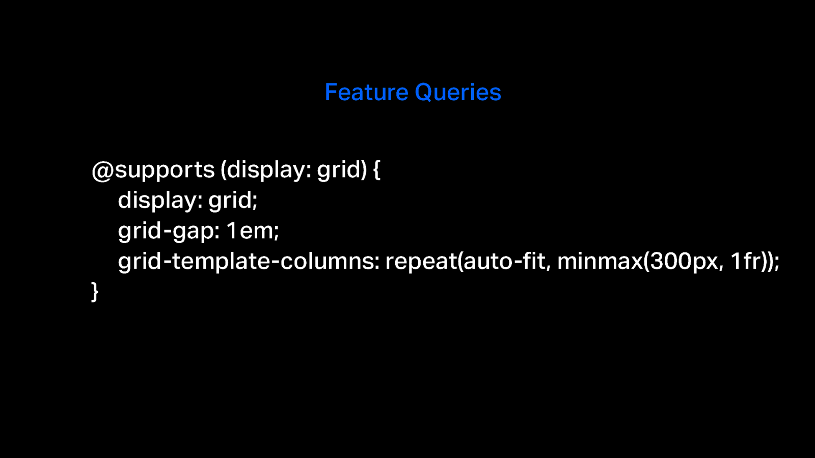
Feature Queries @supports (display: grid) { display: grid; grid-gap: 1em; grid-template-columns: repeat(auto-fit, minmax(300px, 1fr)); }
Slide 28
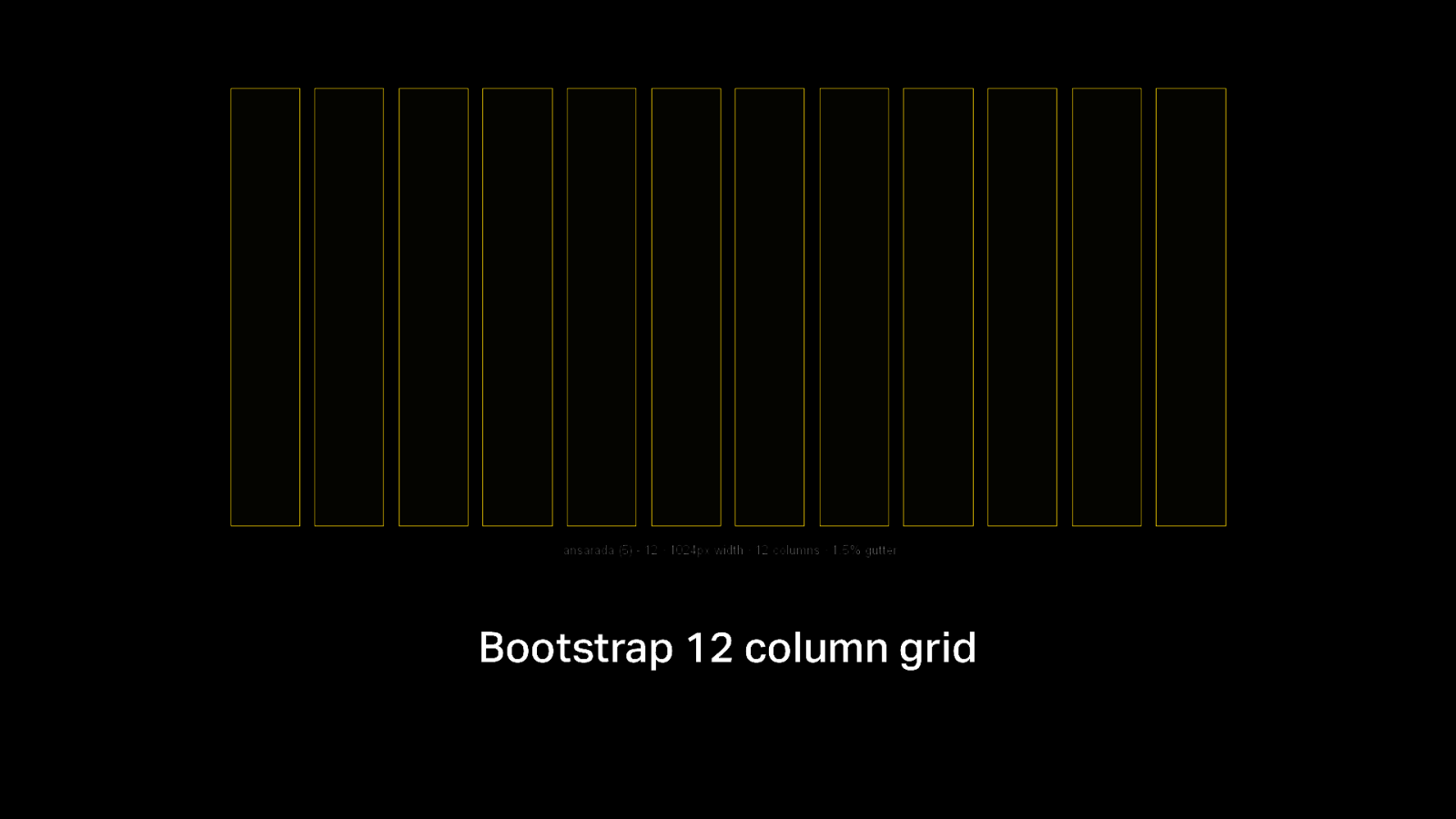
Bootstrap 12 column grid
Slide 29
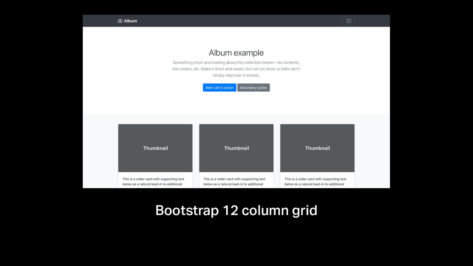
Bootstrap 12 column grid
Slide 30
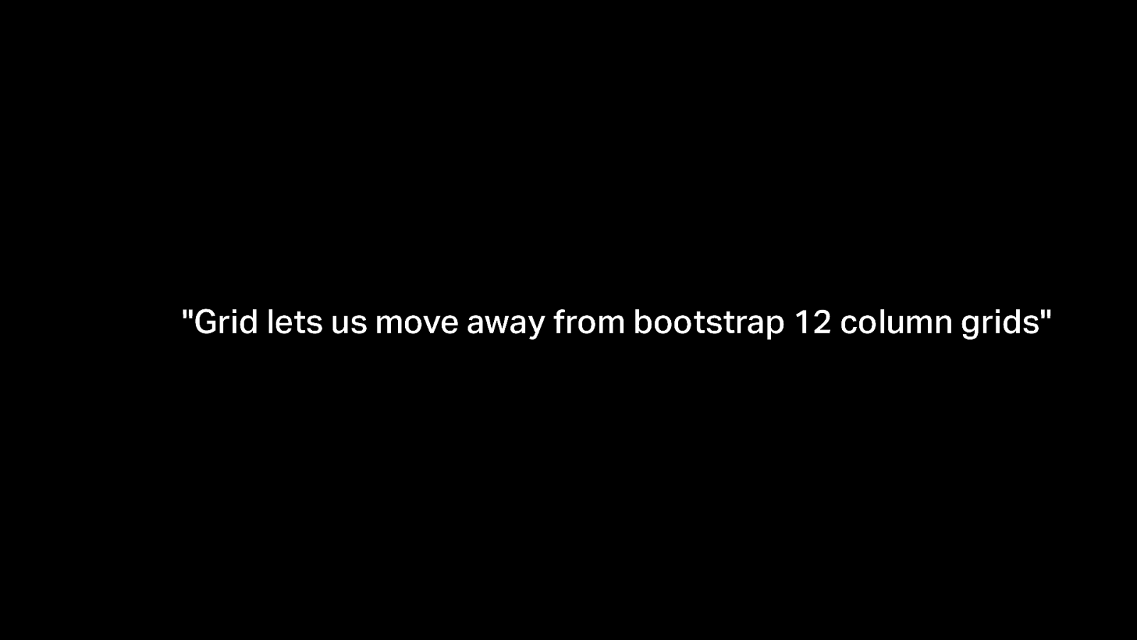
"Grid lets us move away from bootstrap 12 column grids"
Slide 31
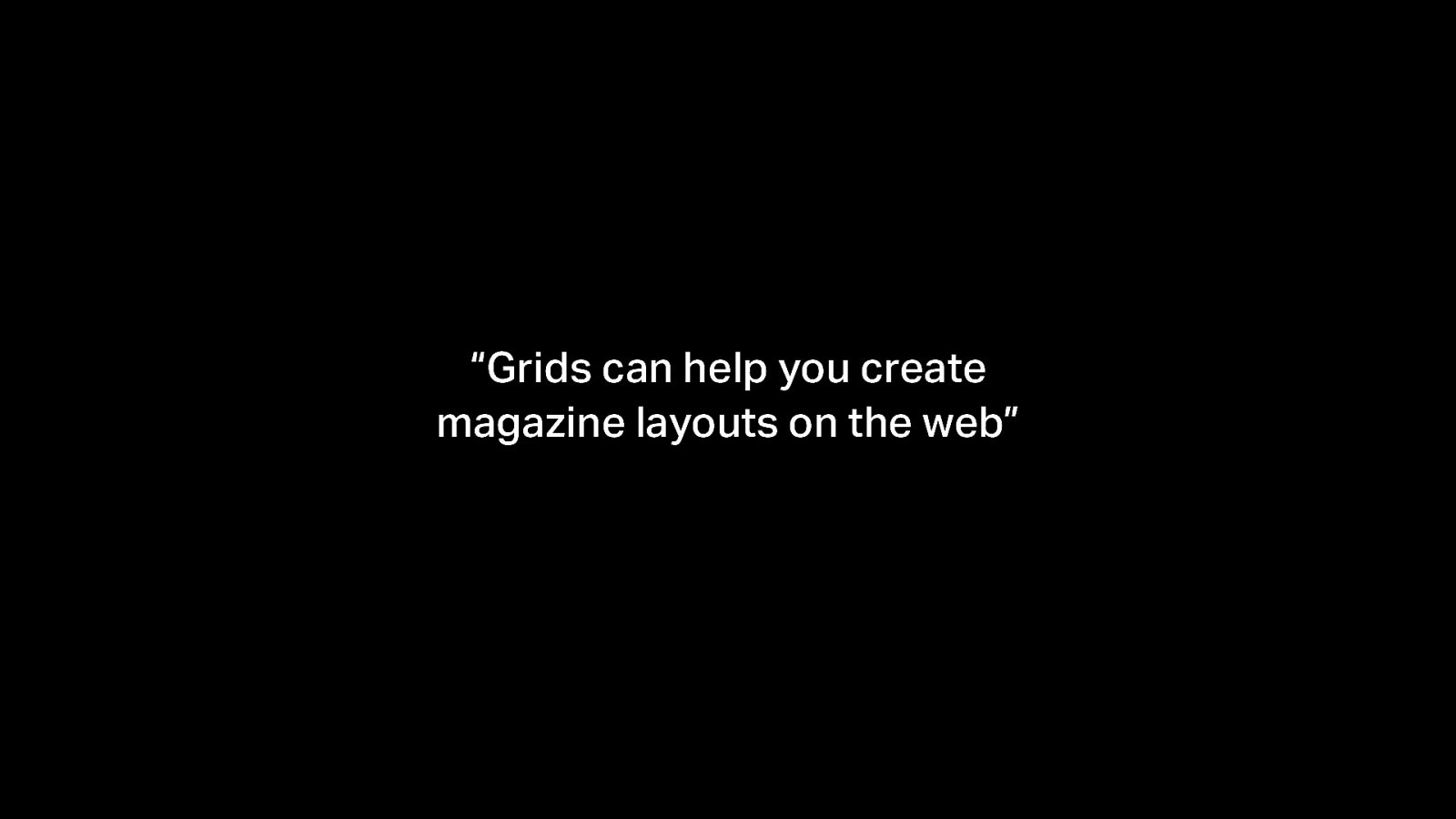
“Grids can help you create magazine layouts on the web”
Slide 32
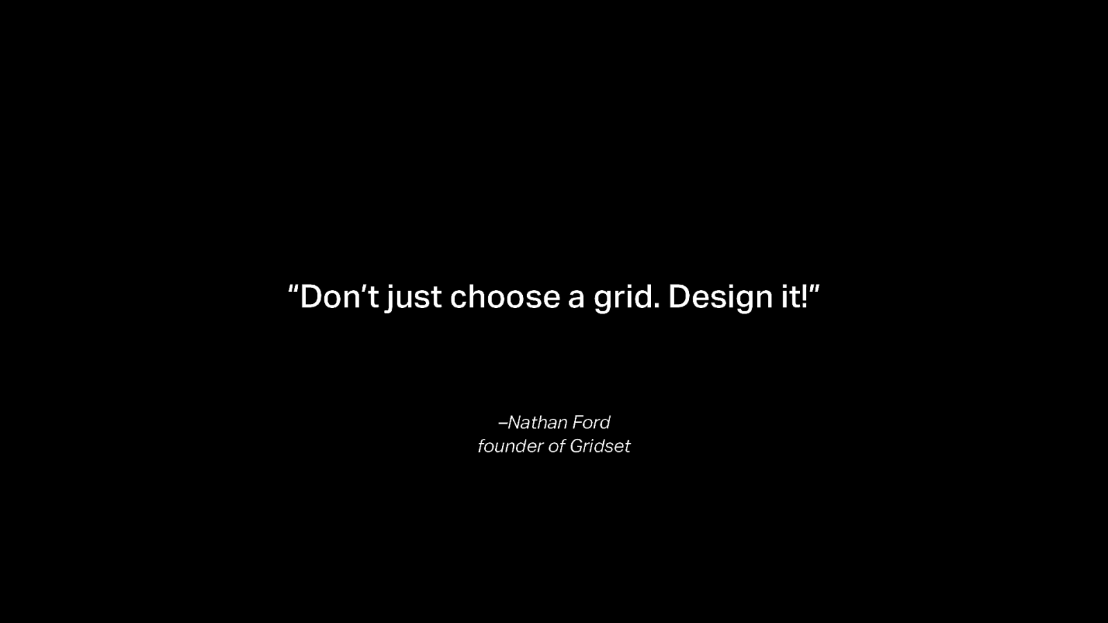
“Don’t just choose a grid. Design it!” –Nathan Ford founder of Gridset
Slide 33
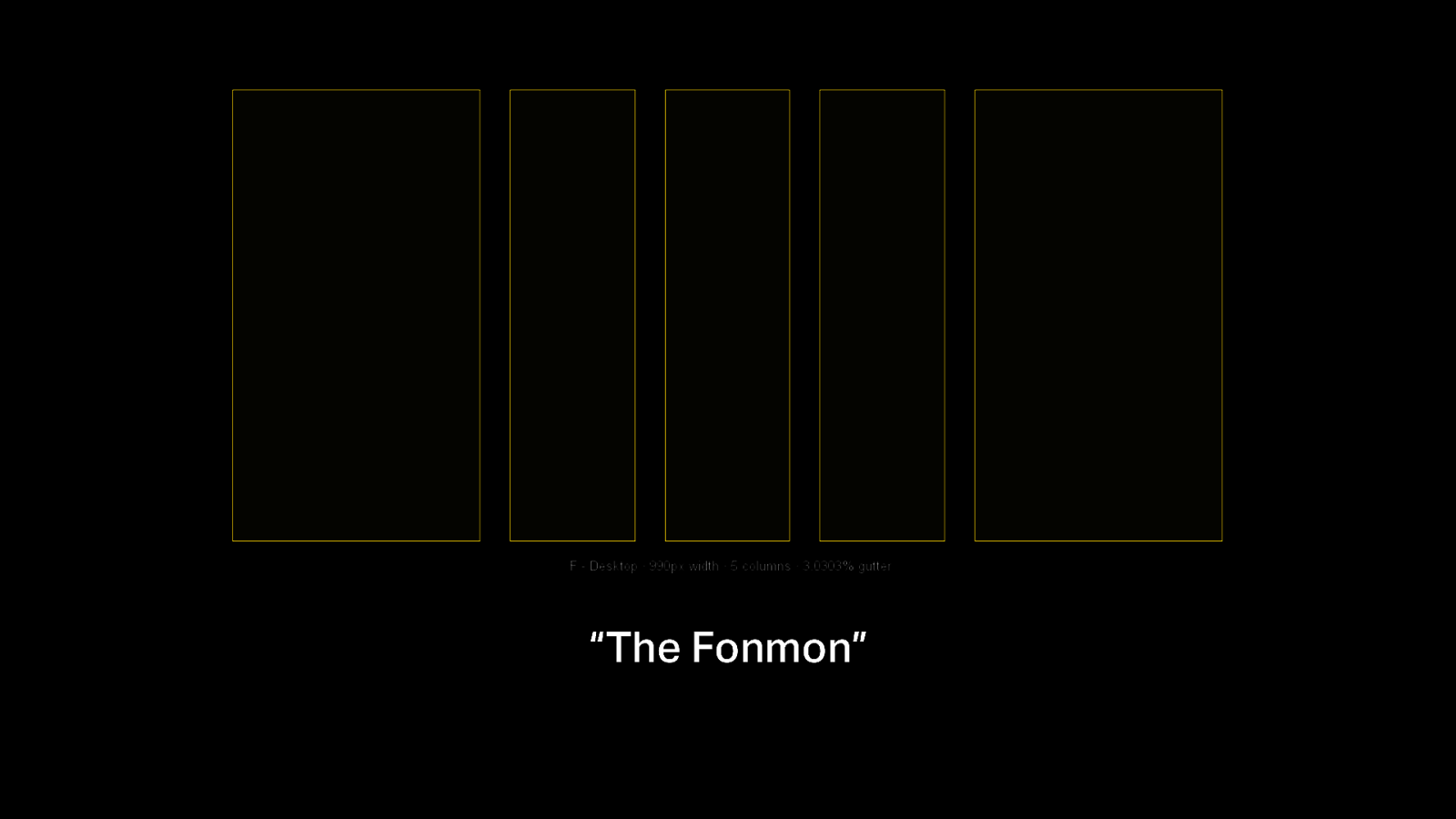
“The Fonmon”
Slide 34
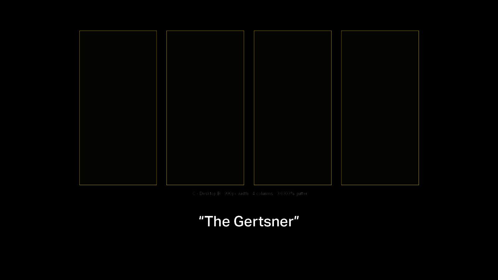
“The Gertsner”
Slide 35
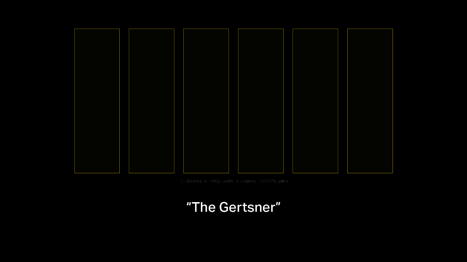
“The Gertsner”
Slide 36
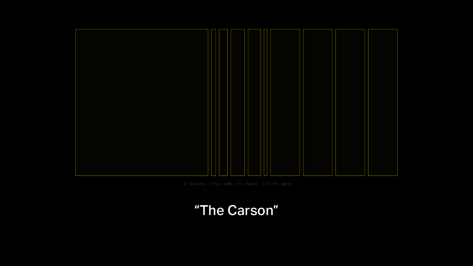
“The Carson”
Slide 37

Andy Clarke, Head of Creative at Stuff and Nonsense. Design consultant and mentor. Author of “Art Direction for the Web” @malarkey https://stuffandnonsense.co.uk
Slide 38

“Art direction and design helps your audience feel something”
Slide 39
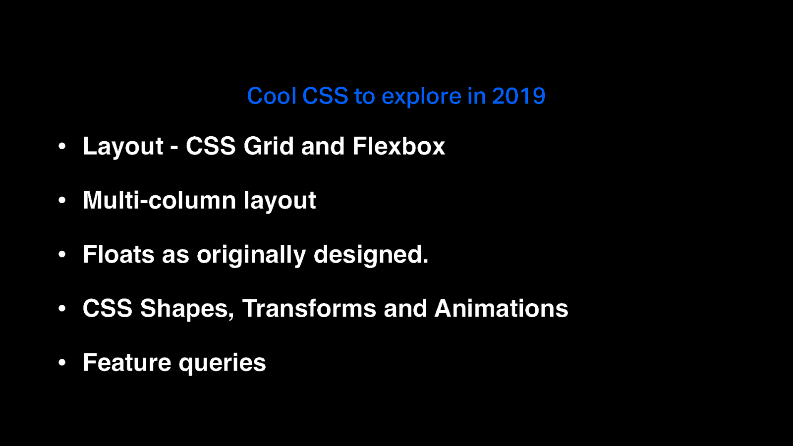
Cool CSS to explore in 2019 • Layout - CSS Grid and Flexbox • Multi-column layout • Floats as originally designed. • CSS Shapes, Transforms and Animations • Feature queries
Slide 40
Slide 41
Slide 42
Slide 43
Slide 44

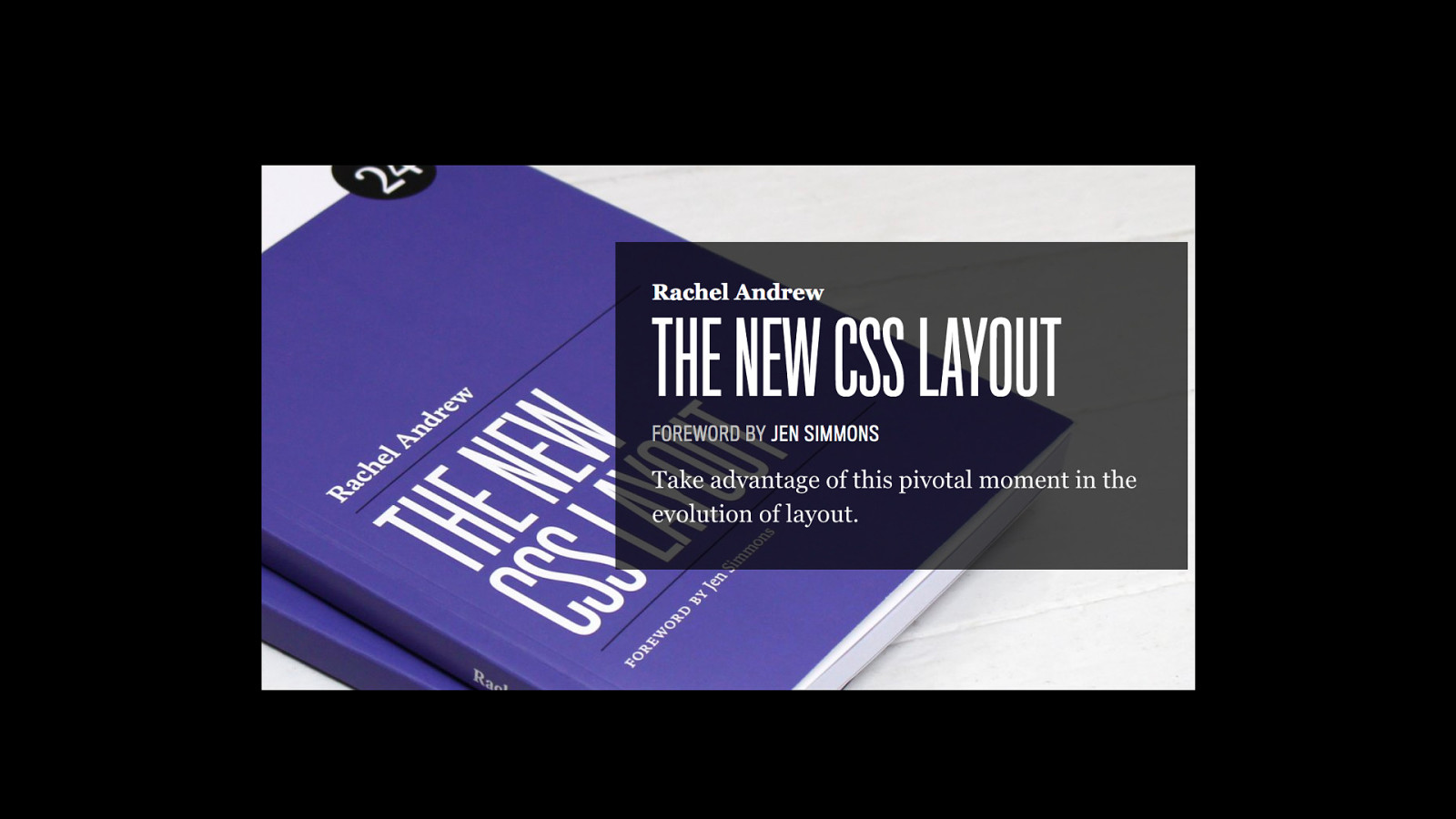
Rachel Andrew @rachelandrew https://rachelandrew.co.uk Photo by Drew McLellan
Slide 45
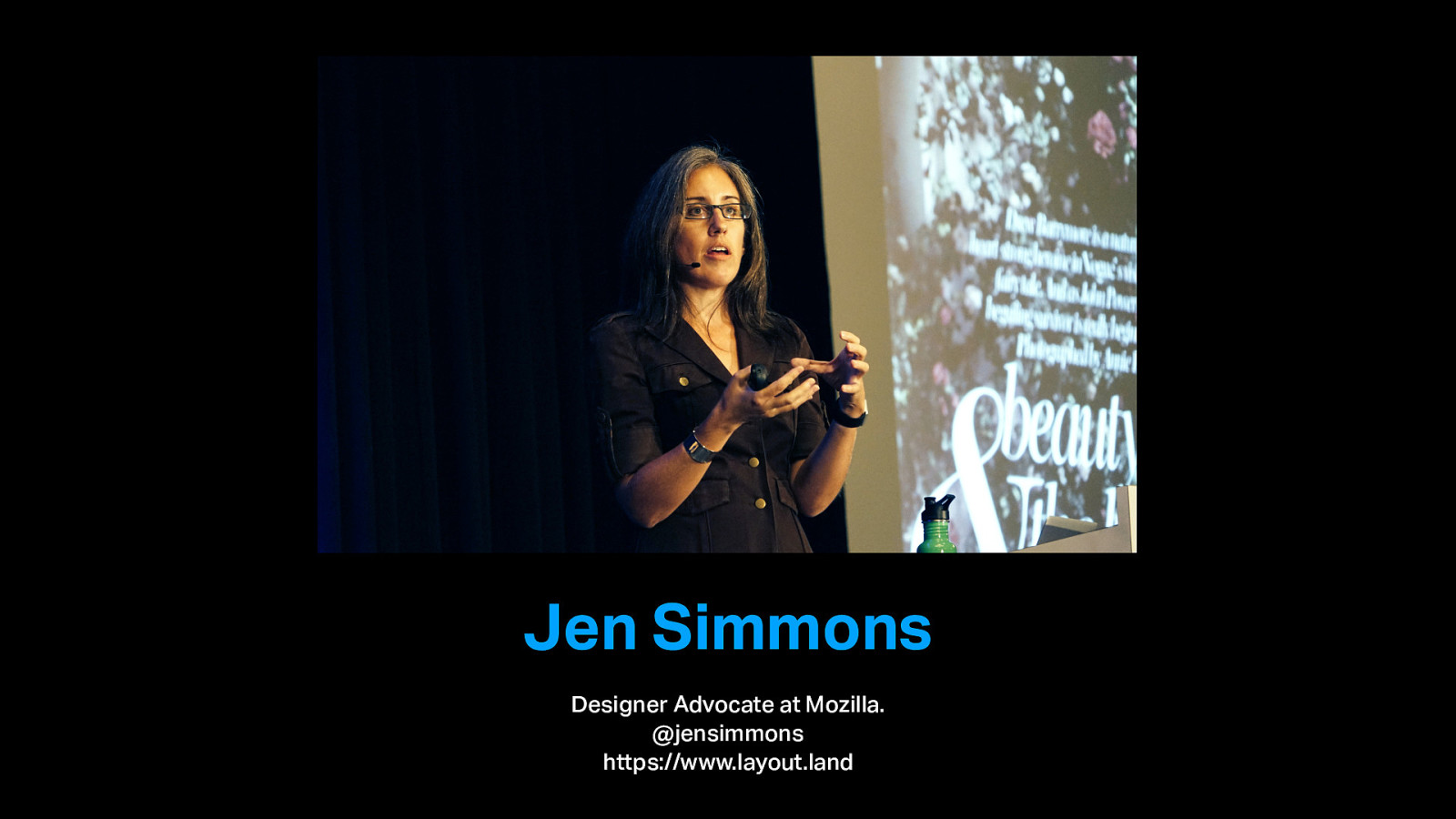
Jen Simmons Designer Advocate at Mozilla. @jensimmons https://www.layout.land
Slide 46

“If I can leave you with any advice, it is to make room for time to play with new things.”
Slide 47
Thank you. https://speaking.scottgruber.me @scott_gruber