Space Apps Challenge 2018 Kickoff Web Design Accessibility, Performance and Aesthetics Scott Gruber Pasadena, October 2018
Slide 1
Slide 2
www.ioes.ucla.edu
Slide 3
Slide 4
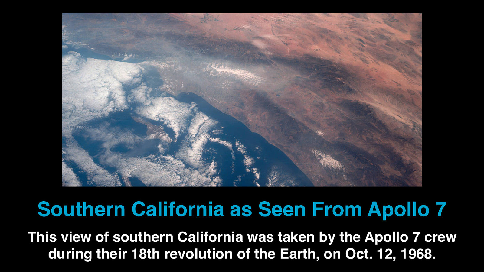
Southern California as Seen From Apollo 7 This view of southern California was taken by the Apollo 7 crew during their 18th revolution of the Earth, on Oct. 12, 1968.
Slide 5
What are the building blocks of the web?
Slide 6

HTML and CSS
Slide 7
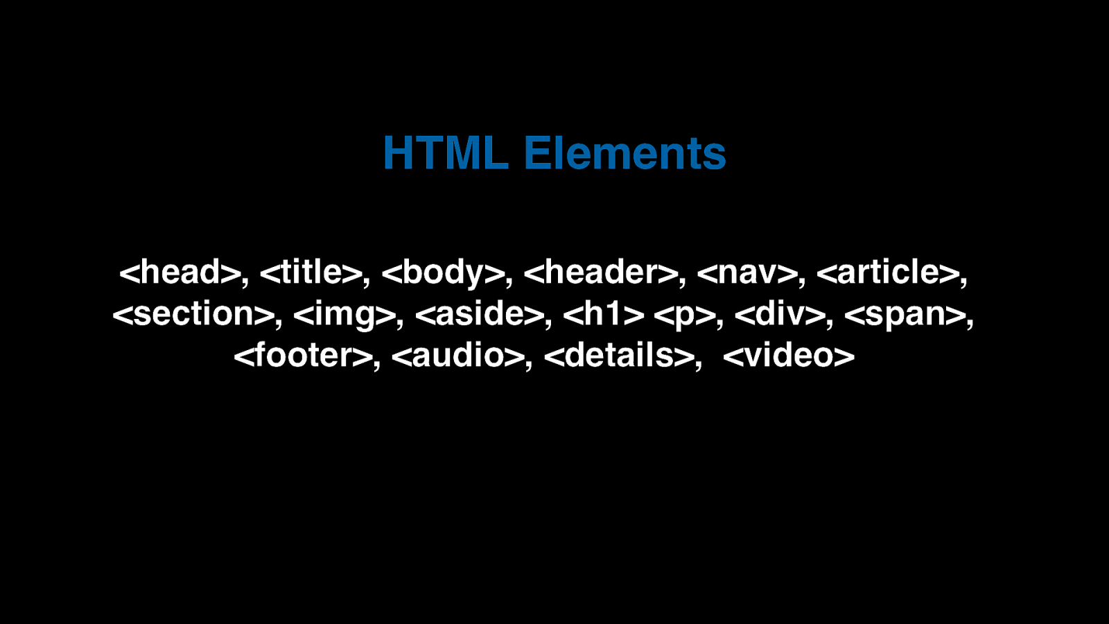
HTML Elements <head>, <title>, <body>, <header>, <nav>, <article>, <section>, <img>, <aside>, <h1> <p>, <div>, <span>, <footer>, <audio>, <details>, <video>
Slide 8
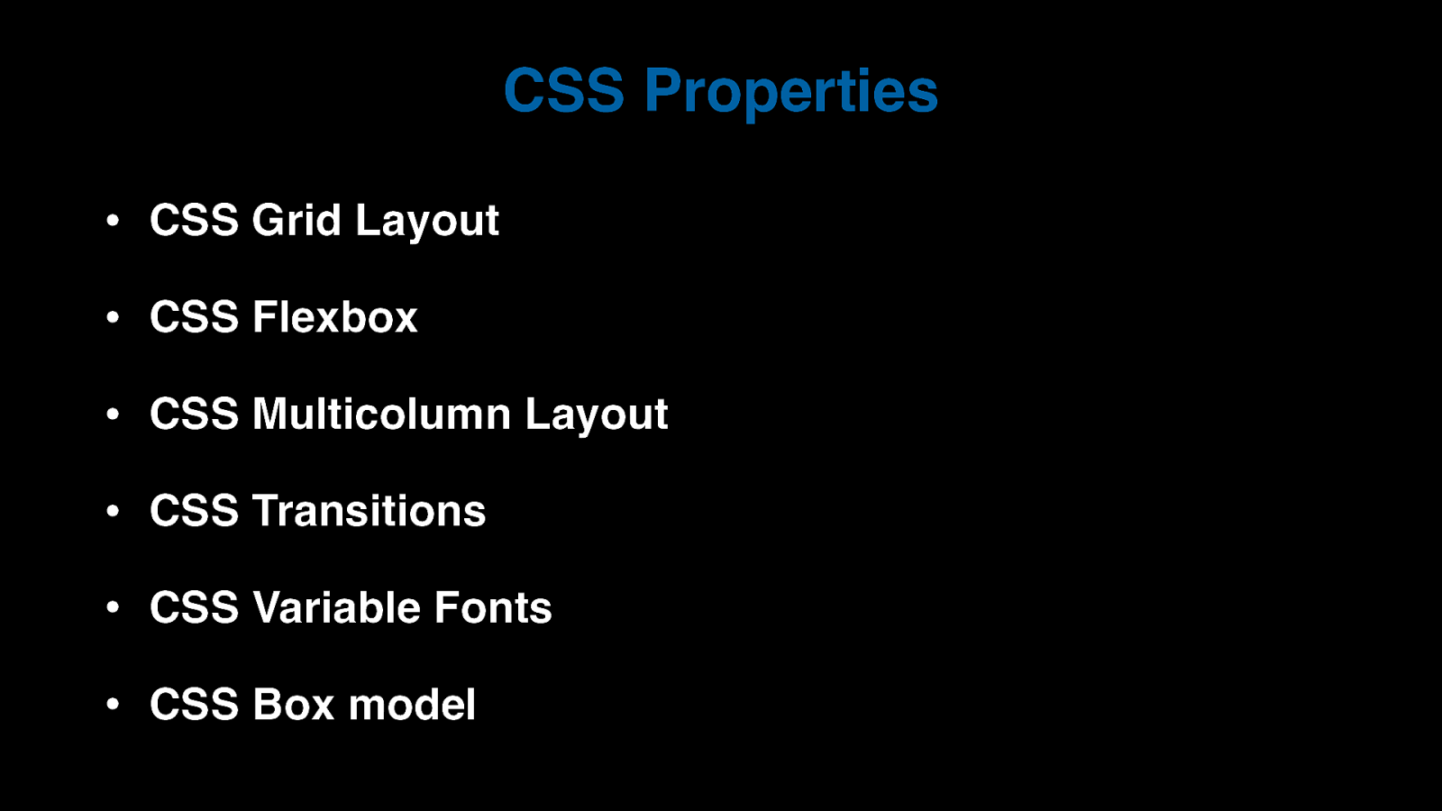
CSS Properties • CSS Grid Layout • CSS Flexbox • CSS Multicolumn Layout • CSS Transitions • CSS Variable Fonts • CSS Box model
Slide 9
Is building for the web easy?
Slide 10
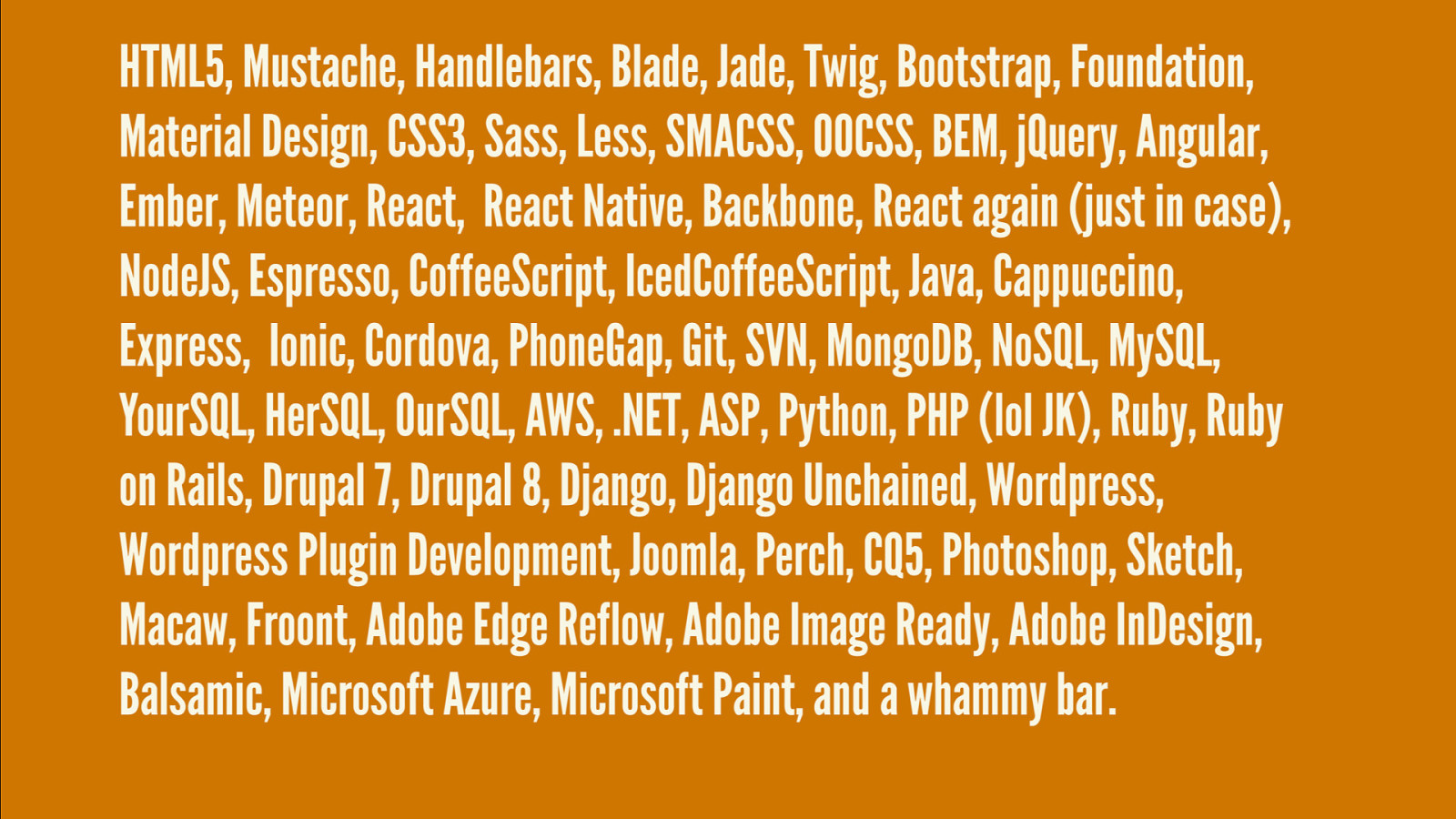
Slide 11
It makes me nervous just thinking about it!
Slide 12
Let's all take a deep breath.
Slide 13

Breathe.
Slide 14
OK. Feel better?
Slide 15
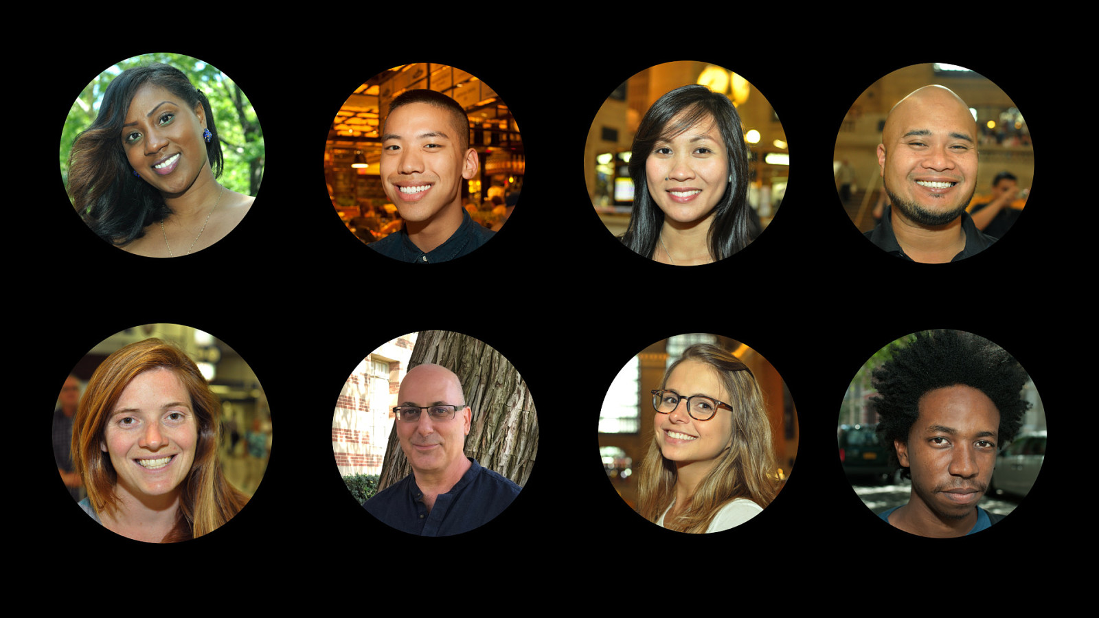
What kind of people use the Internet?
Slide 16
Slide 17
Who do we need to design for?
Slide 18

Everyone.
Slide 19
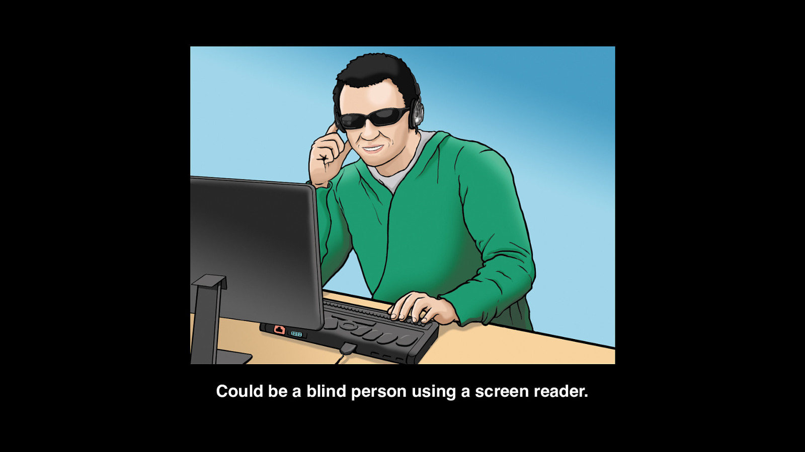
Could be a blind person using a screen reader.
Slide 20
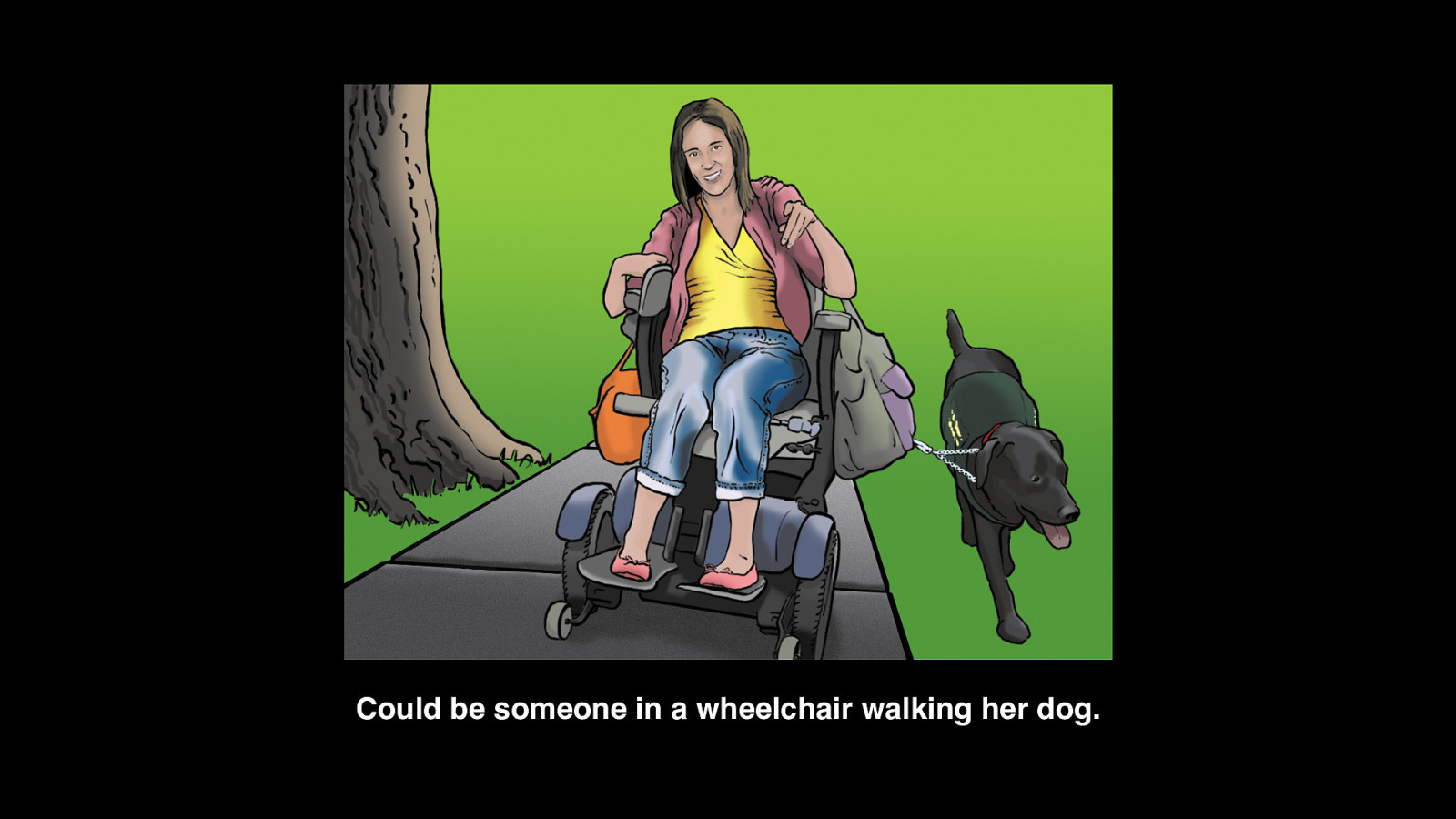
Could be someone in a wheelchair walking her dog.
Slide 21
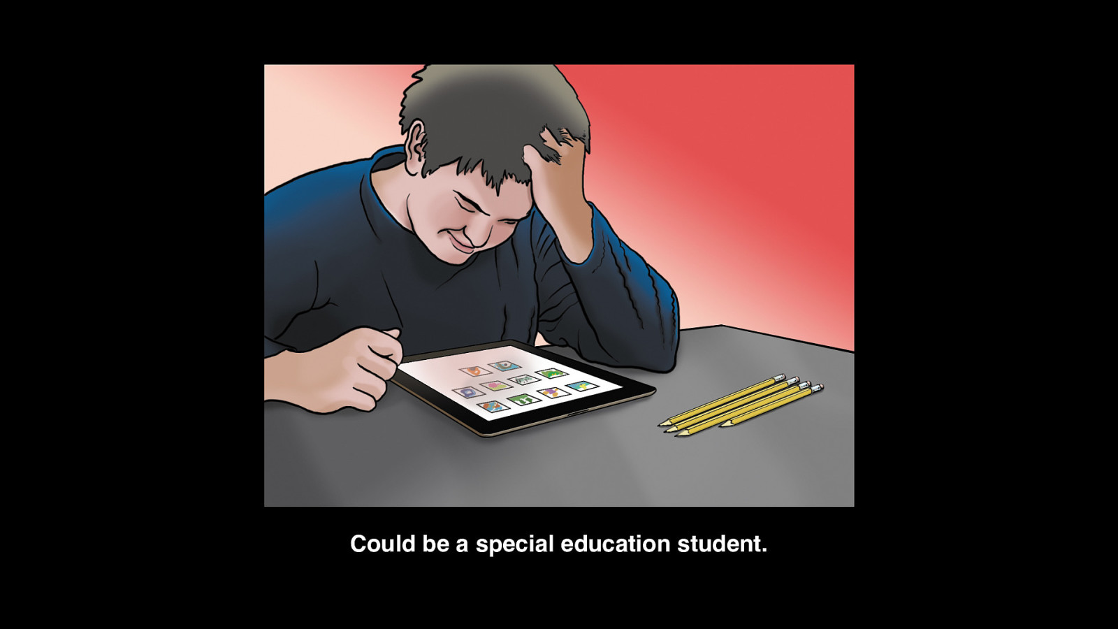
Could be a special education student.
Slide 22
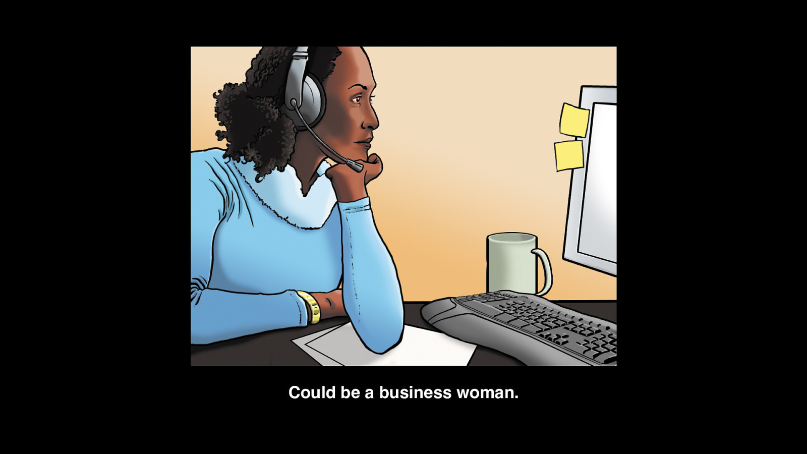
Could be a business woman.
Slide 23
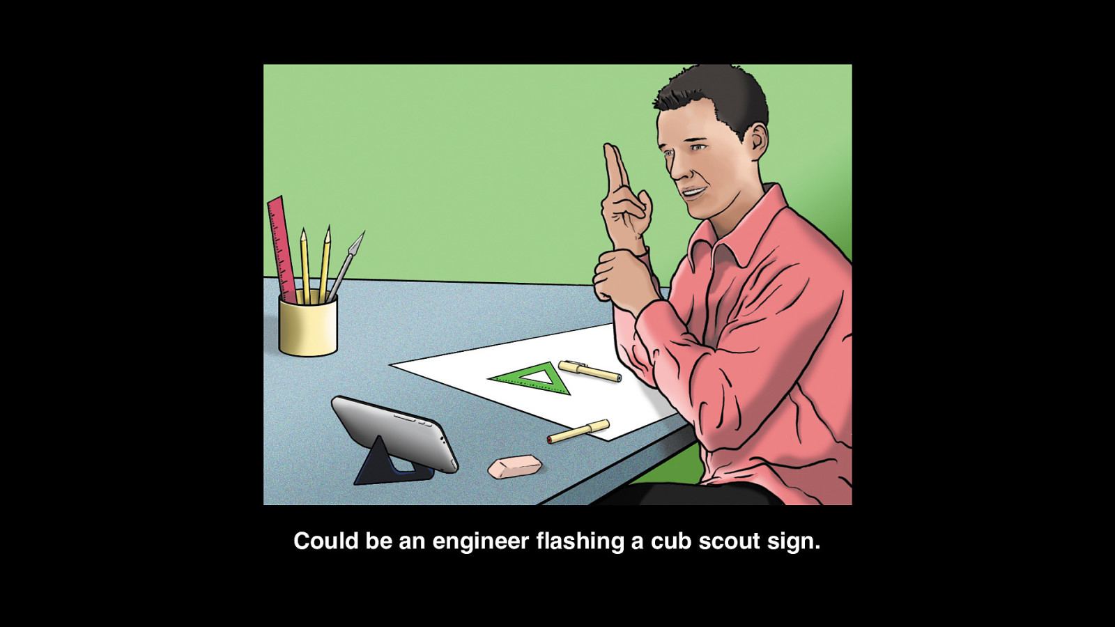
Could be an engineer flashing a cub scout sign.
Slide 24
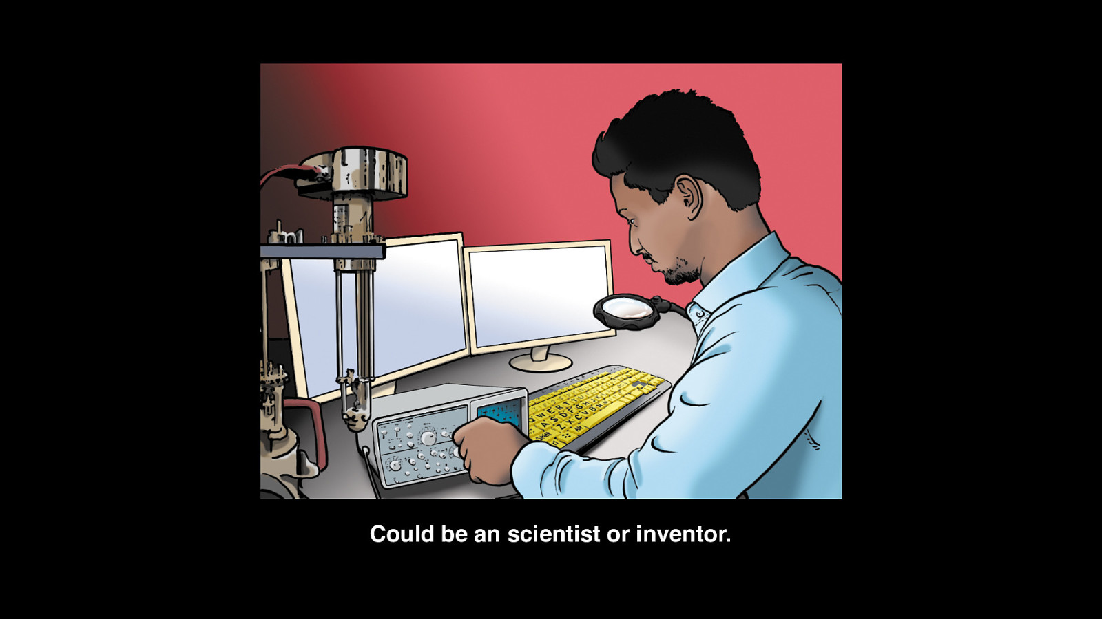
Could be an scientist or inventor.
Slide 25
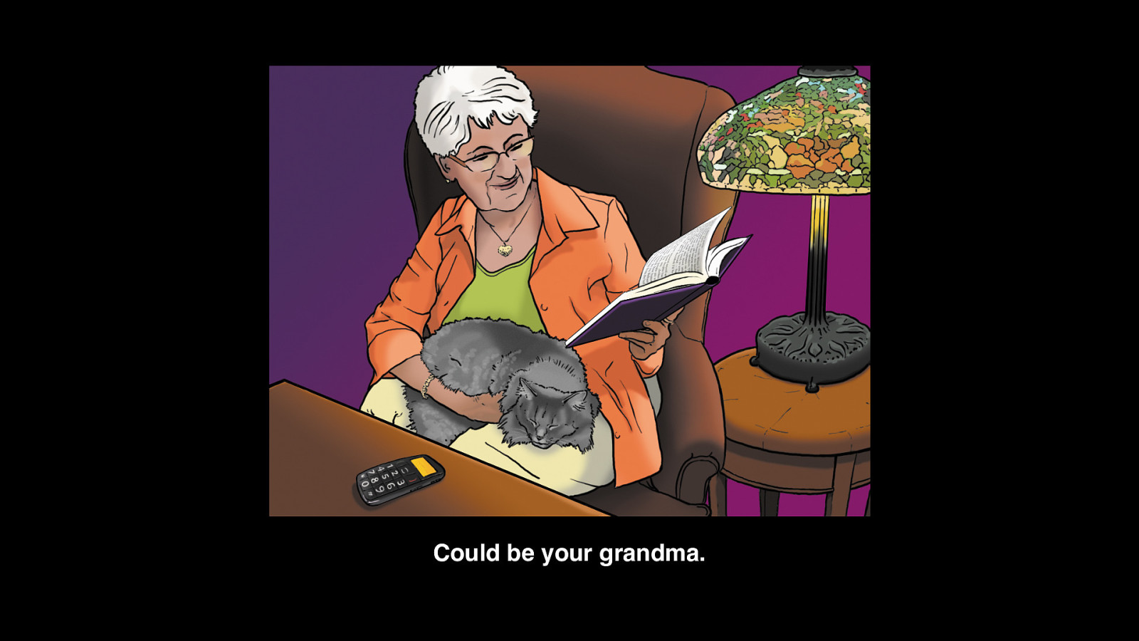
Could be your grandma.
Slide 26

Could be you.
Slide 27
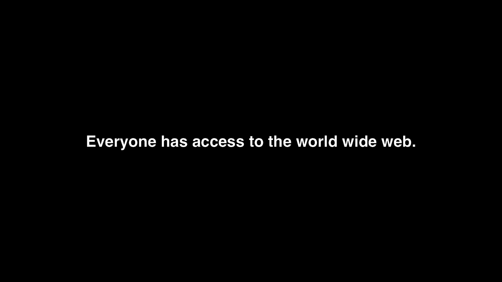
Everyone has access to the world wide web.
Slide 28
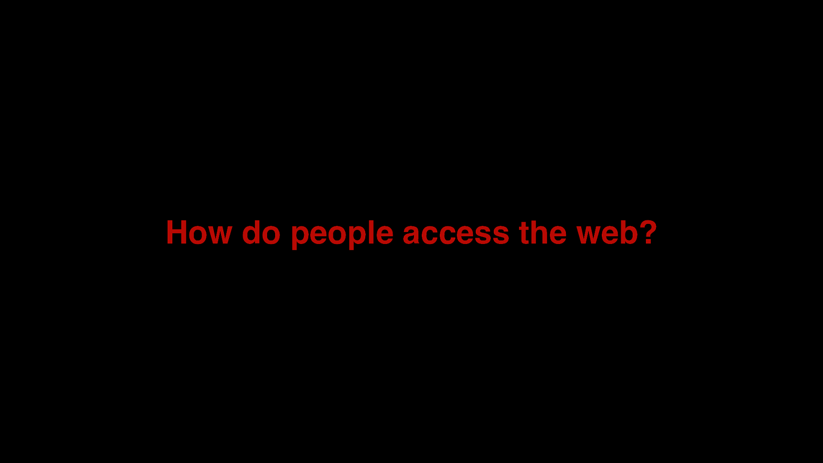
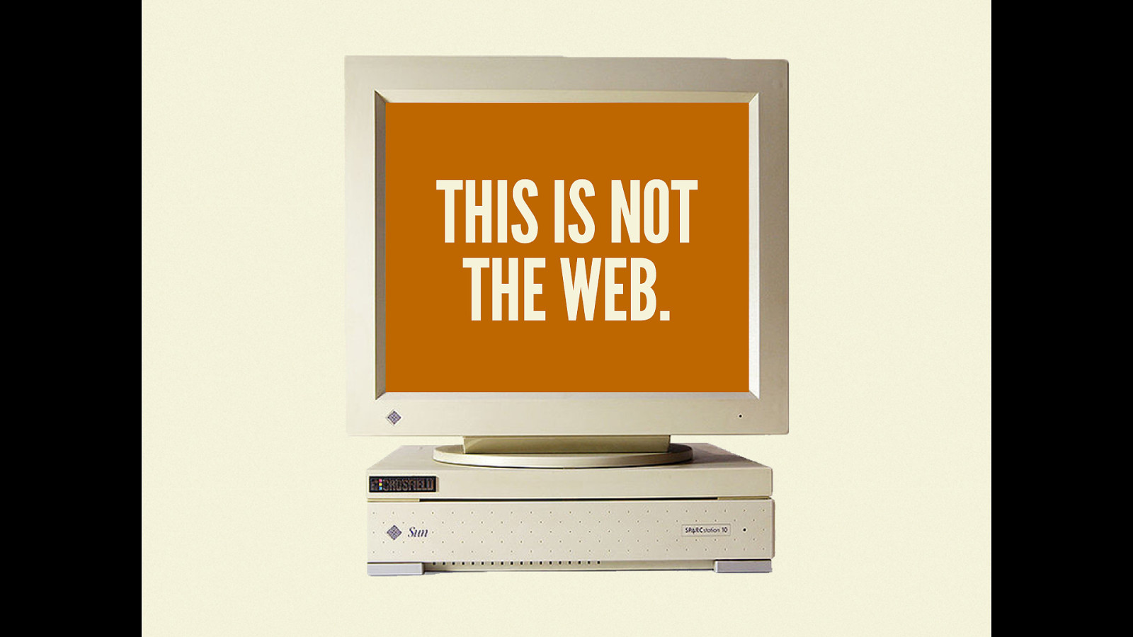
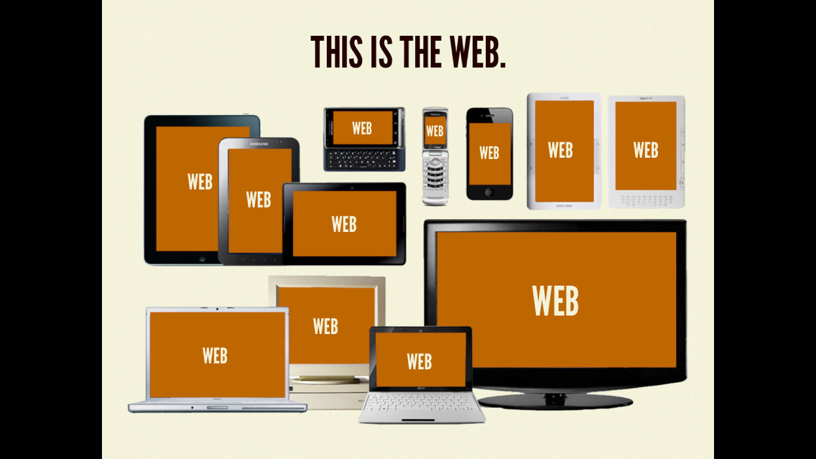
How do people access the web?
Slide 29
Slide 30
Slide 31
Slide 32
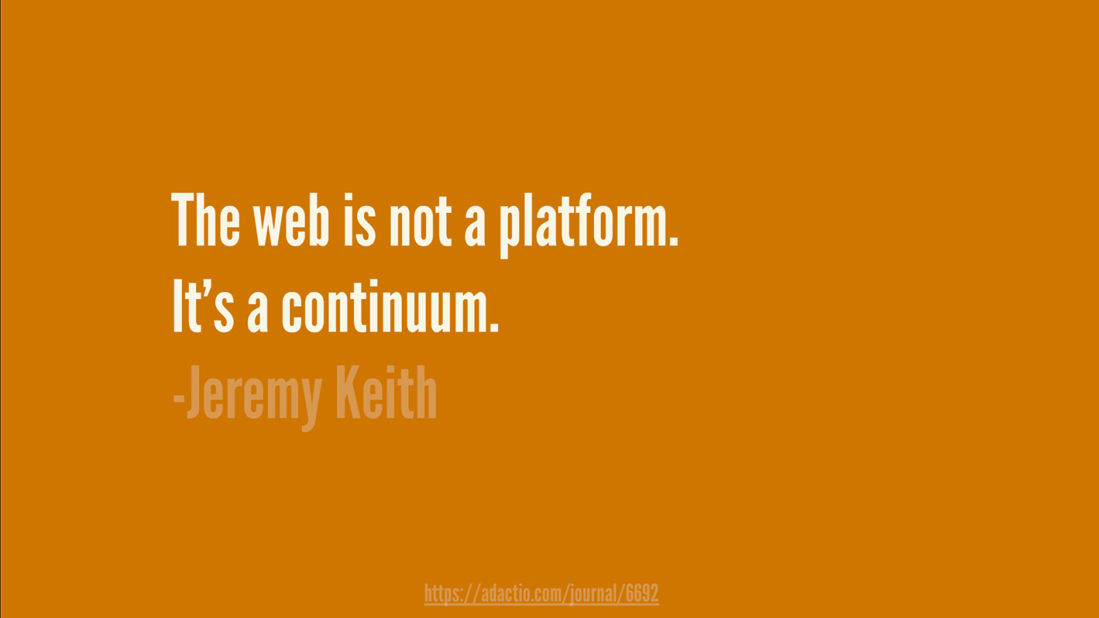
What does that mean?
Slide 33
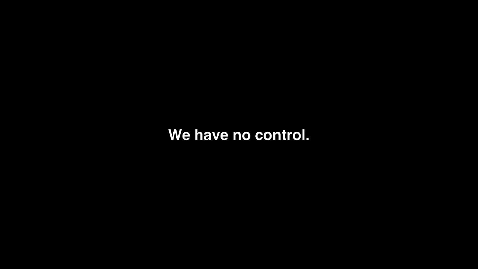
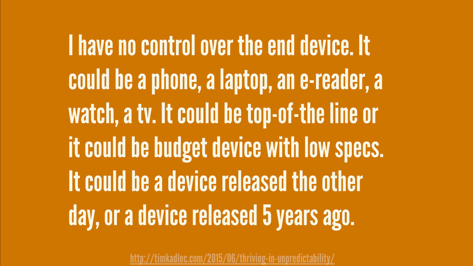
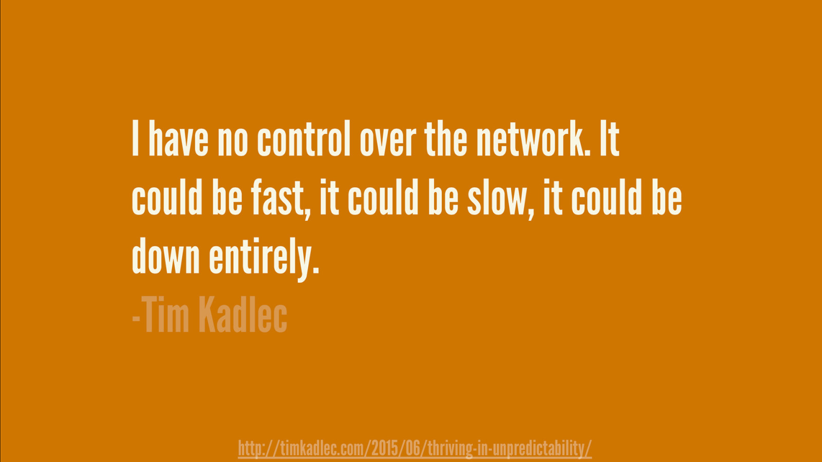
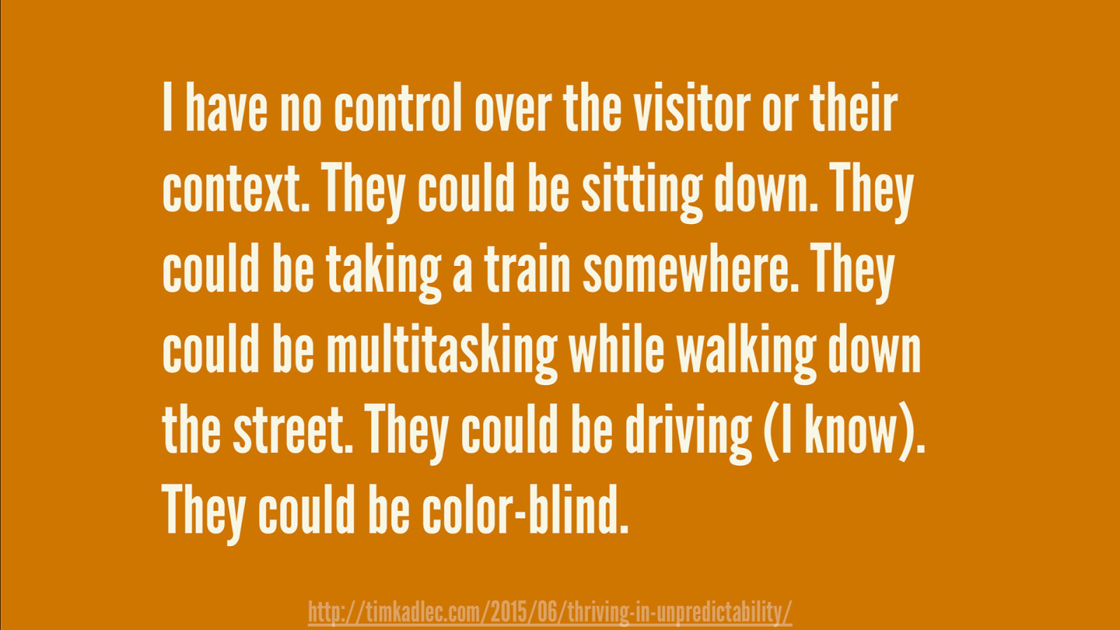
We have no control.
Slide 34
Slide 35
Slide 36
Slide 37
We have no control. And it's ok.
Slide 38
I can only control what I do.
Slide 39
My Design Process Accessibility, Performance and Aesthetics
Slide 40
- Accessibility
Slide 41
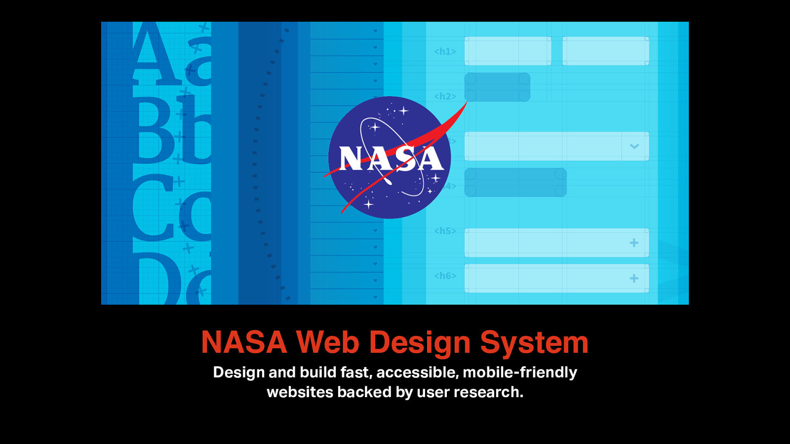
NASA Web Design System Design and build fast, accessible, mobile-friendly websites backed by user research.
Slide 42
“Offer accessibility out of the box.” – NASA Design Principle
Slide 43
Web Content Accessibility Guidelines or WCAG 2.1
Slide 44
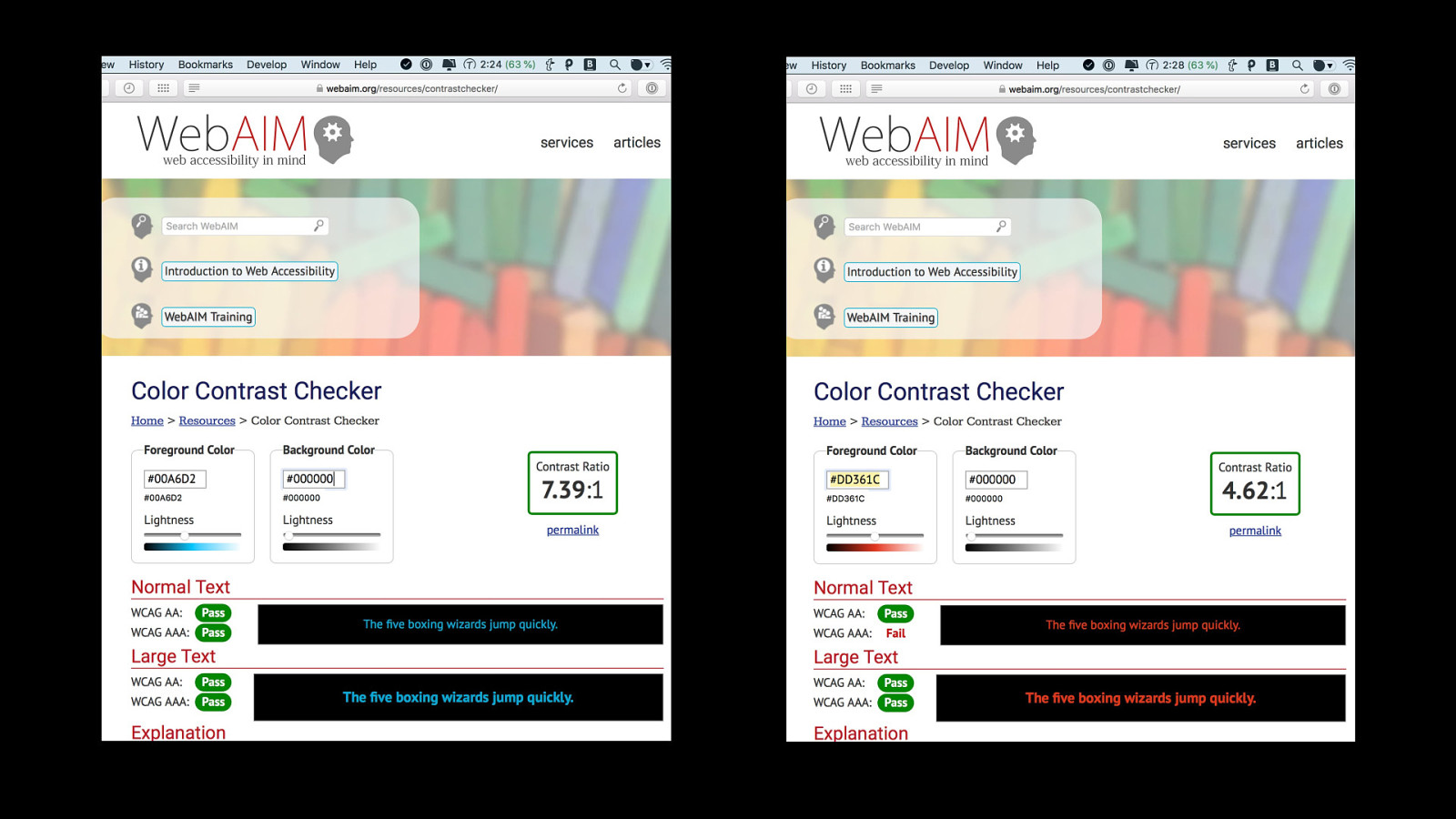
Color Contrast Ratio
Slide 45
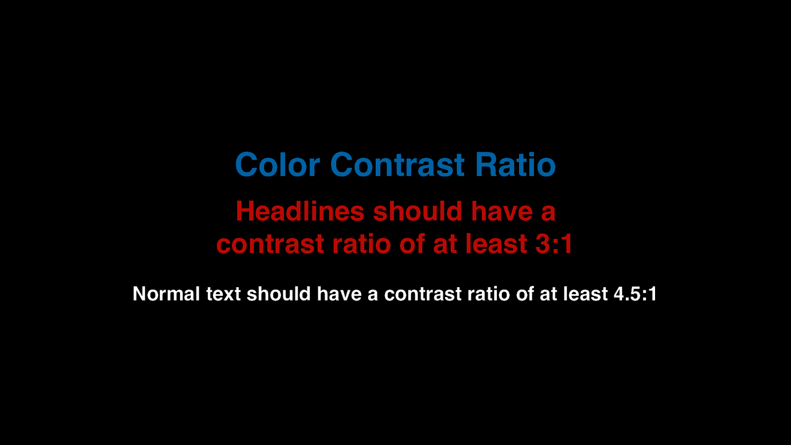
Color Contrast Ratio Headlines should have a contrast ratio of at least 3:1 Normal text should have a contrast ratio of at least 4.5:1
Slide 46
Slide 47
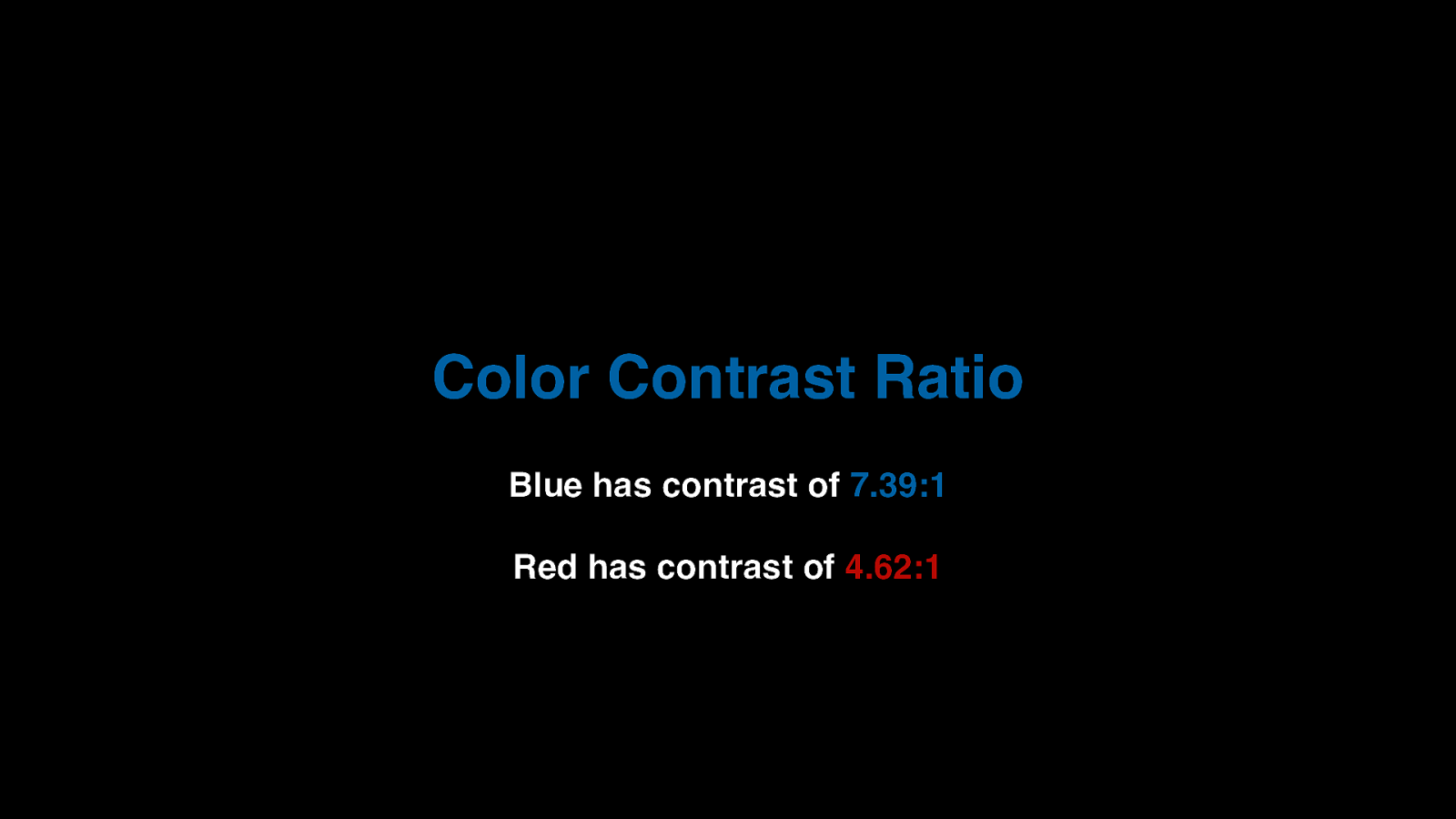
Color Contrast Ratio Blue has contrast of 7.39:1 Red has contrast of 4.62:1
Slide 48
- Performance
Slide 49
Slide 50
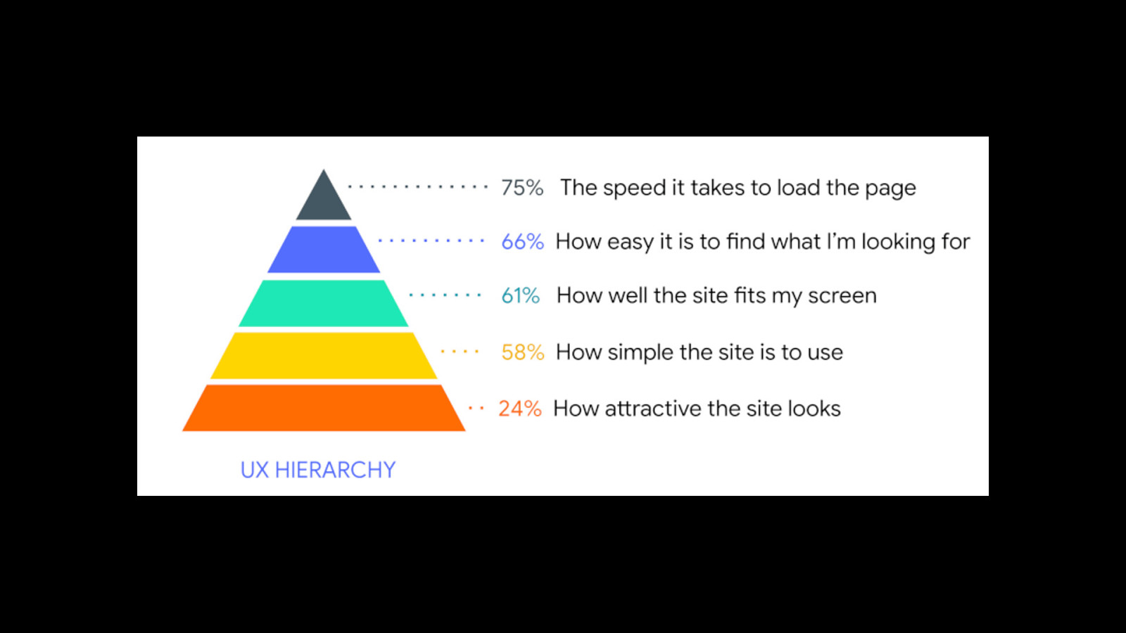
Websites should load fast.
Slide 51
How fast?
Slide 52
In 2 seconds or less!
Slide 53
Don't assume your audience surfs the web on a fast, shiny network
Slide 54
The Need for Speed How do I design for performance?
Slide 55
Set a performance budget
Slide 56
Optimize images
Slide 57

Remove unused code
Slide 58
Test with Google Lighthouse, Web Page Speed Test and Pingdom Tools
Slide 59
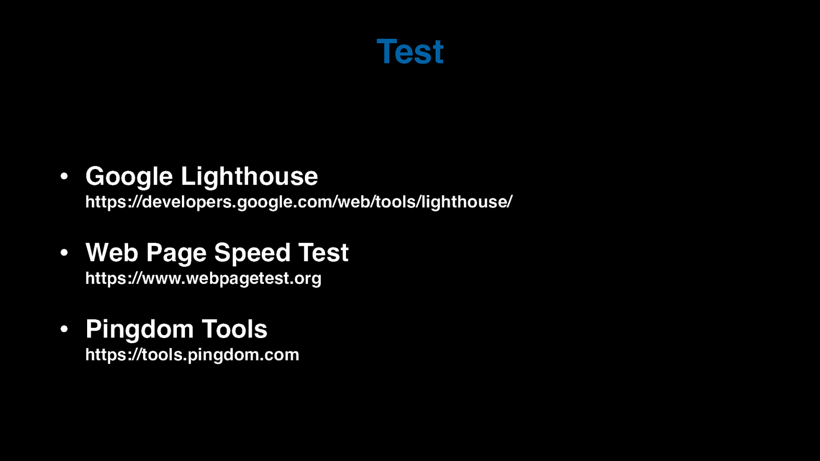
Test • Google Lighthouse • Web Page Speed Test • Pingdom Tools https://developers.google.com/web/tools/lighthouse/ https://www.webpagetest.org https://tools.pingdom.com
Slide 60
- Aesthetics
Slide 61

Websites still gotta look good.
Slide 62
CSS Zen Garden, 2003
Slide 63
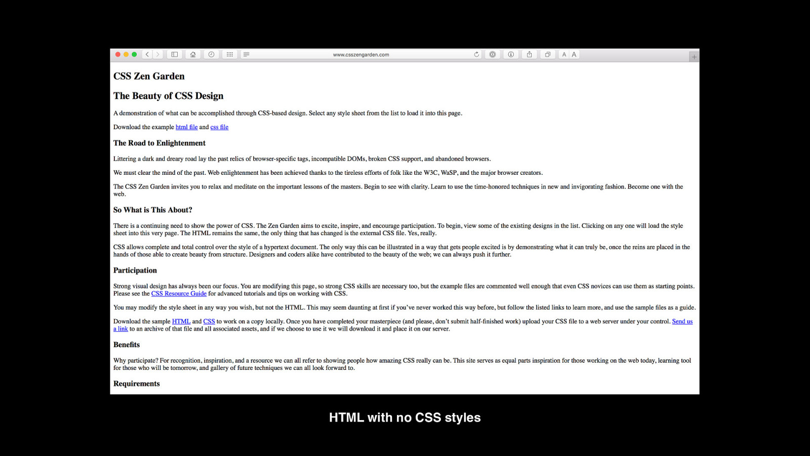
HTML with no CSS styles
Slide 64
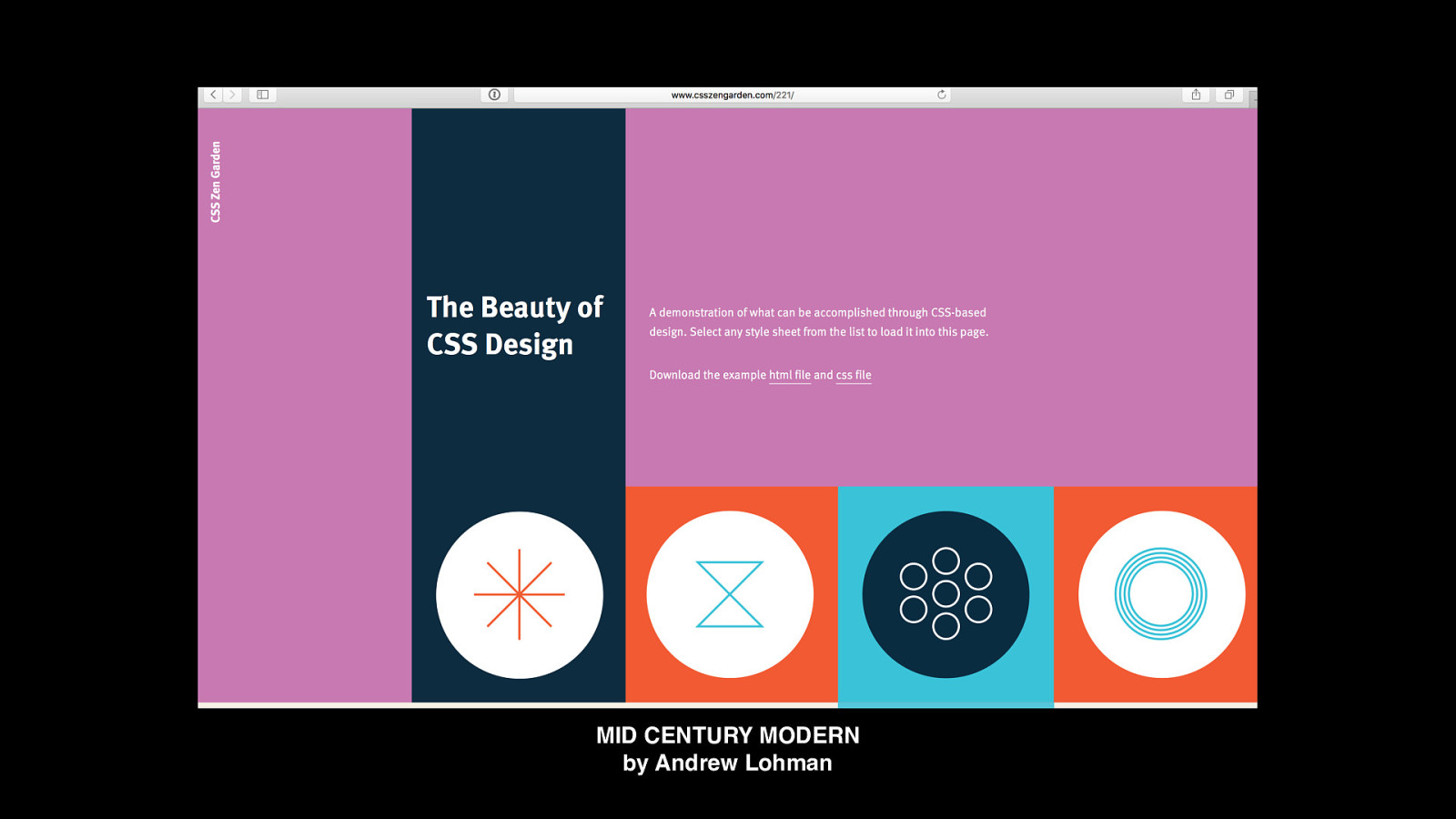
MID CENTURY MODERN by Andrew Lohman
Slide 65
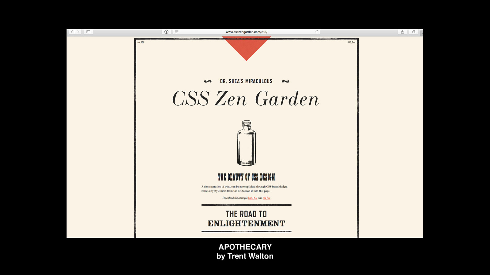
APOTHECARY by Trent Walton
Slide 66
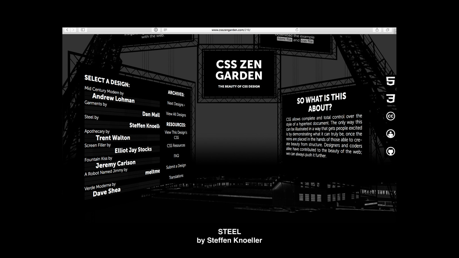
STEEL by Steffen Knoeller
Slide 67
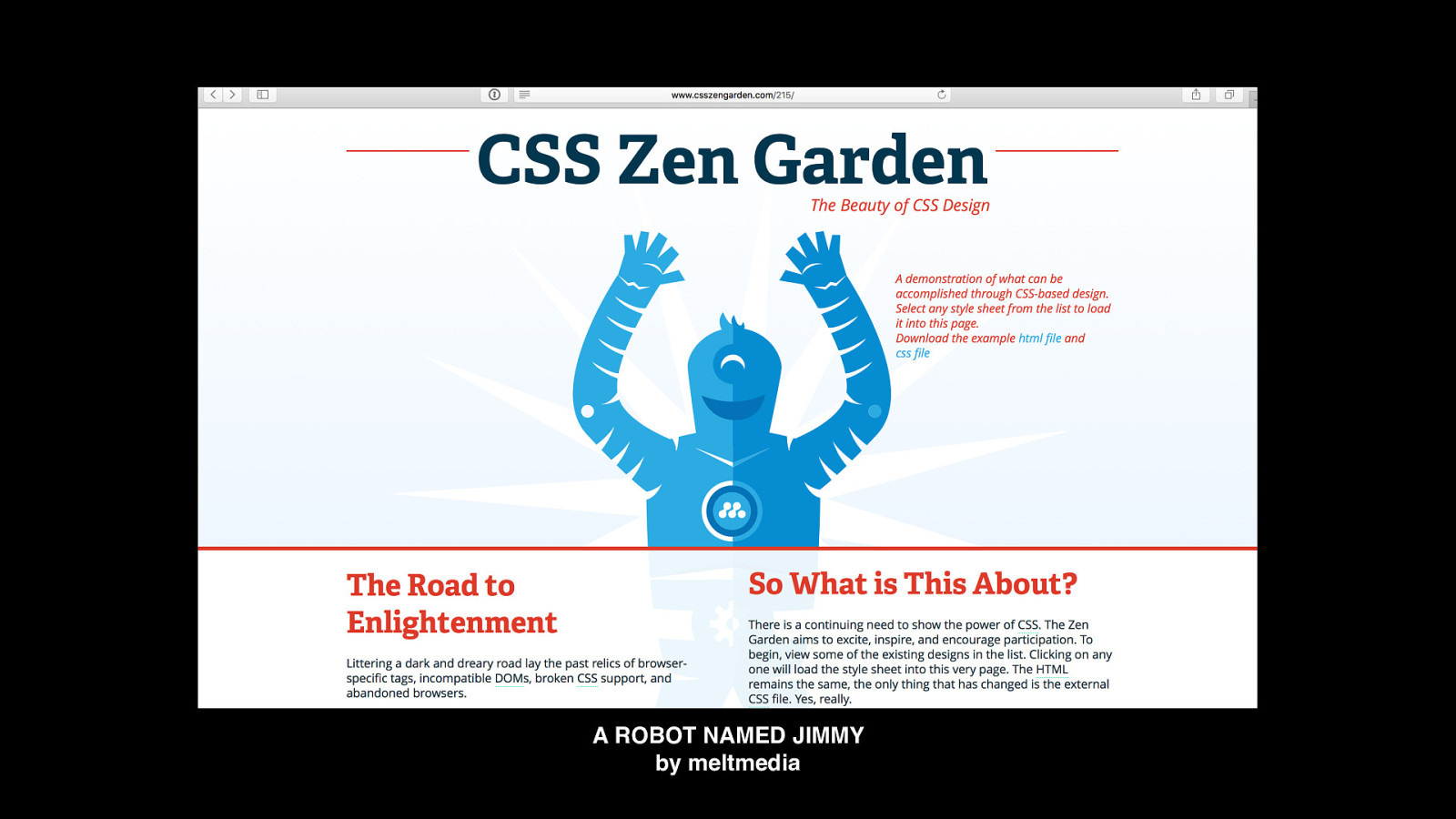
A ROBOT NAMED JIMMY by meltmedia
Slide 68
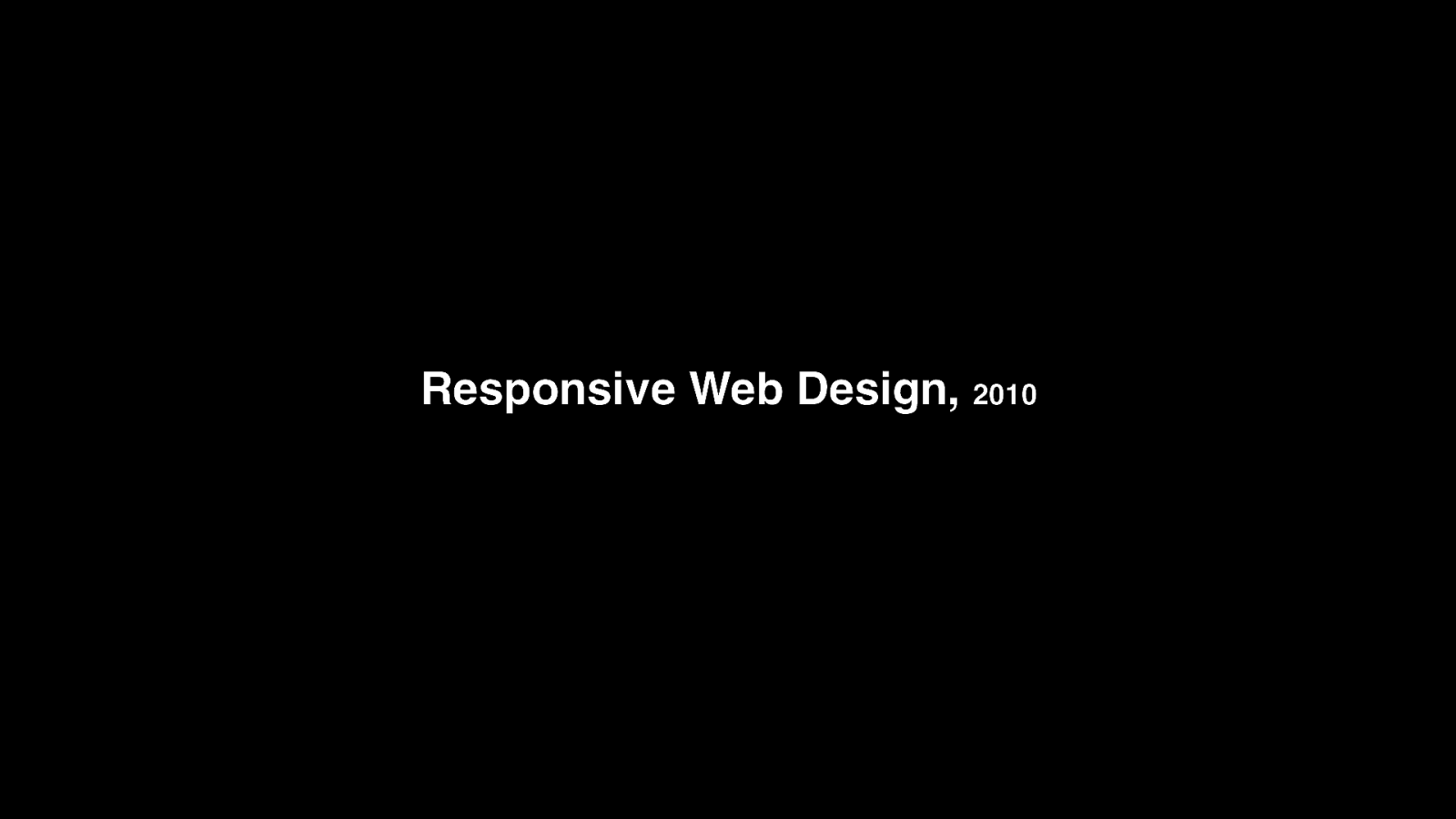
Responsive Web Design, 2010
Slide 69
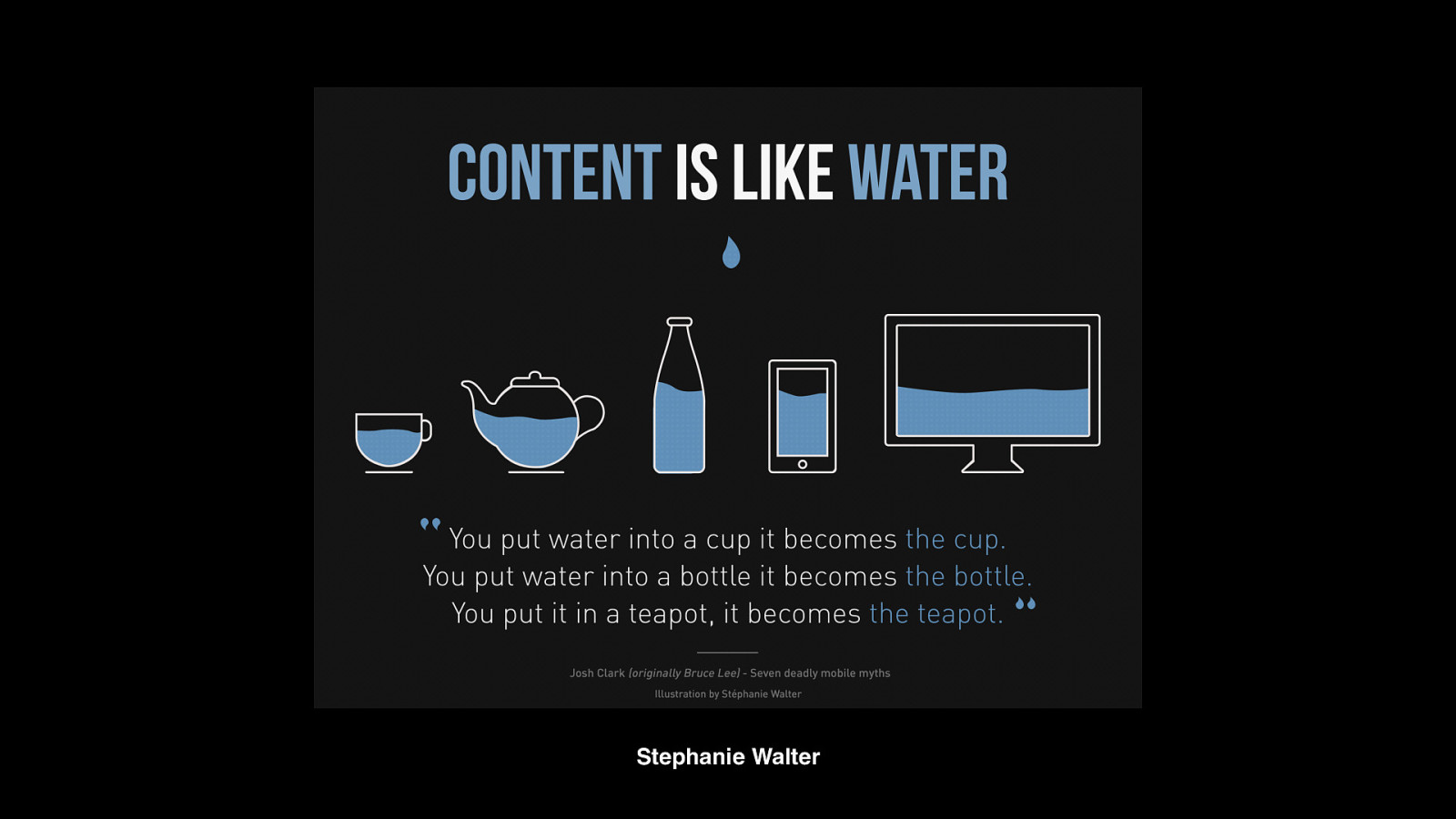
Stephanie Walter
Slide 70
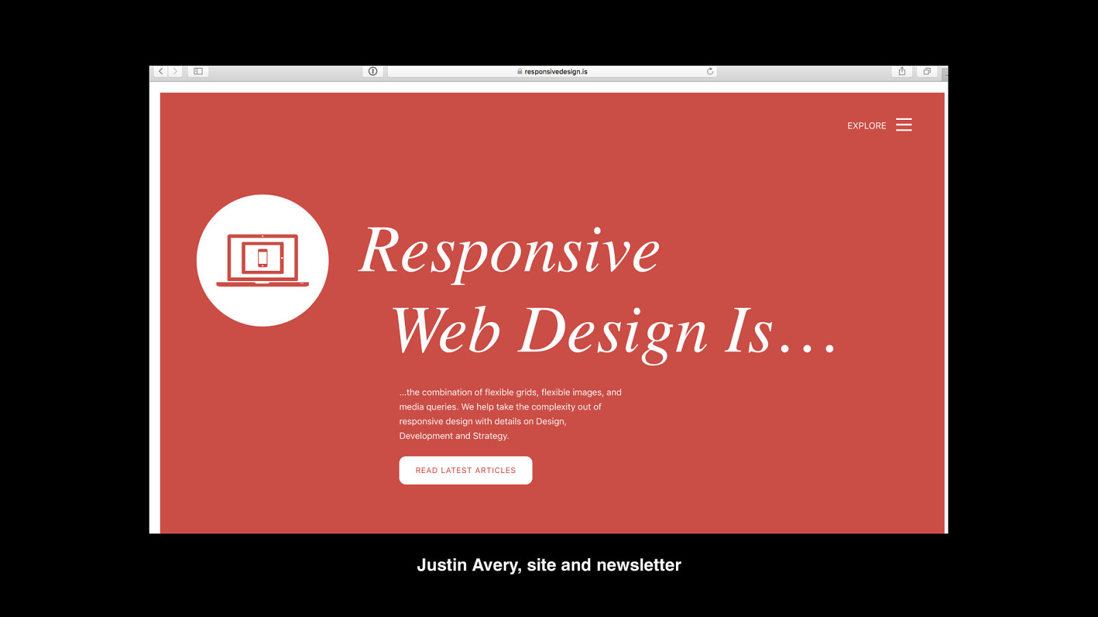
Justin Avery, site and newsletter
Slide 71
“Responsive Web Design is the combination of flexible grids, flexible images, and media queries.” –Justin Avery
Slide 72
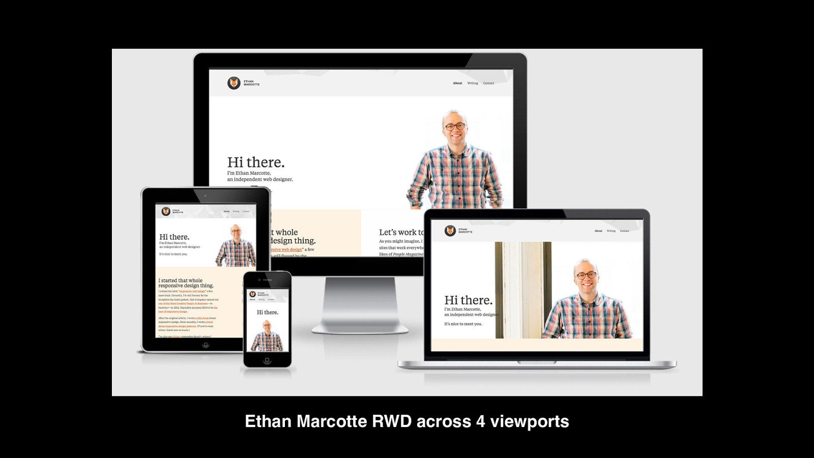
Ethan Marcotte RWD across 4 viewports
Slide 73
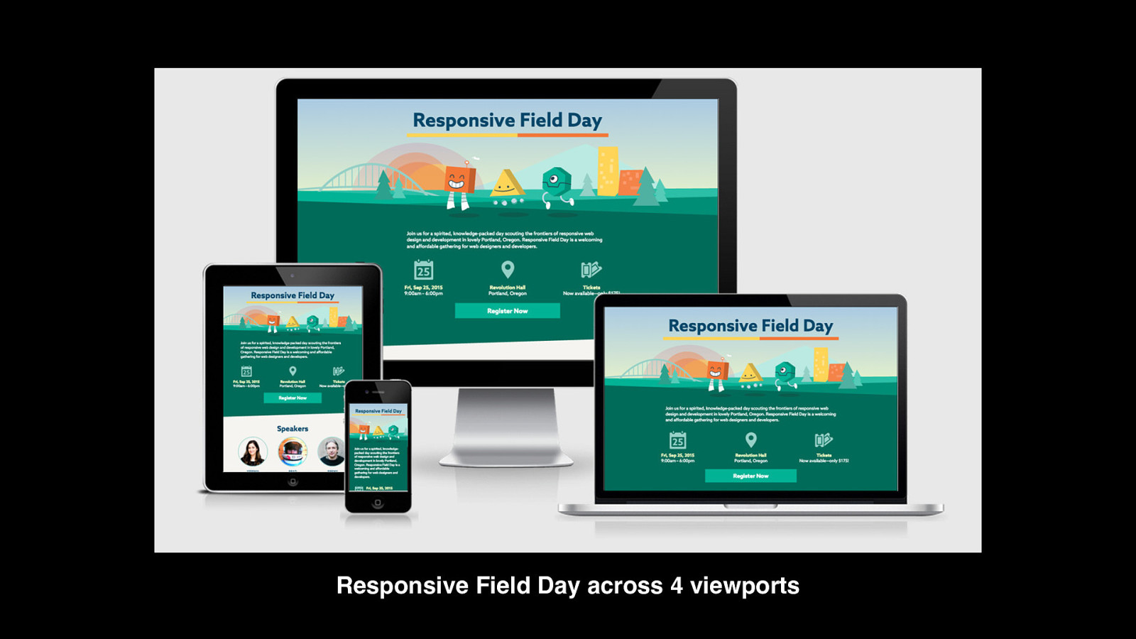
Responsive Field Day across 4 viewports
Slide 74
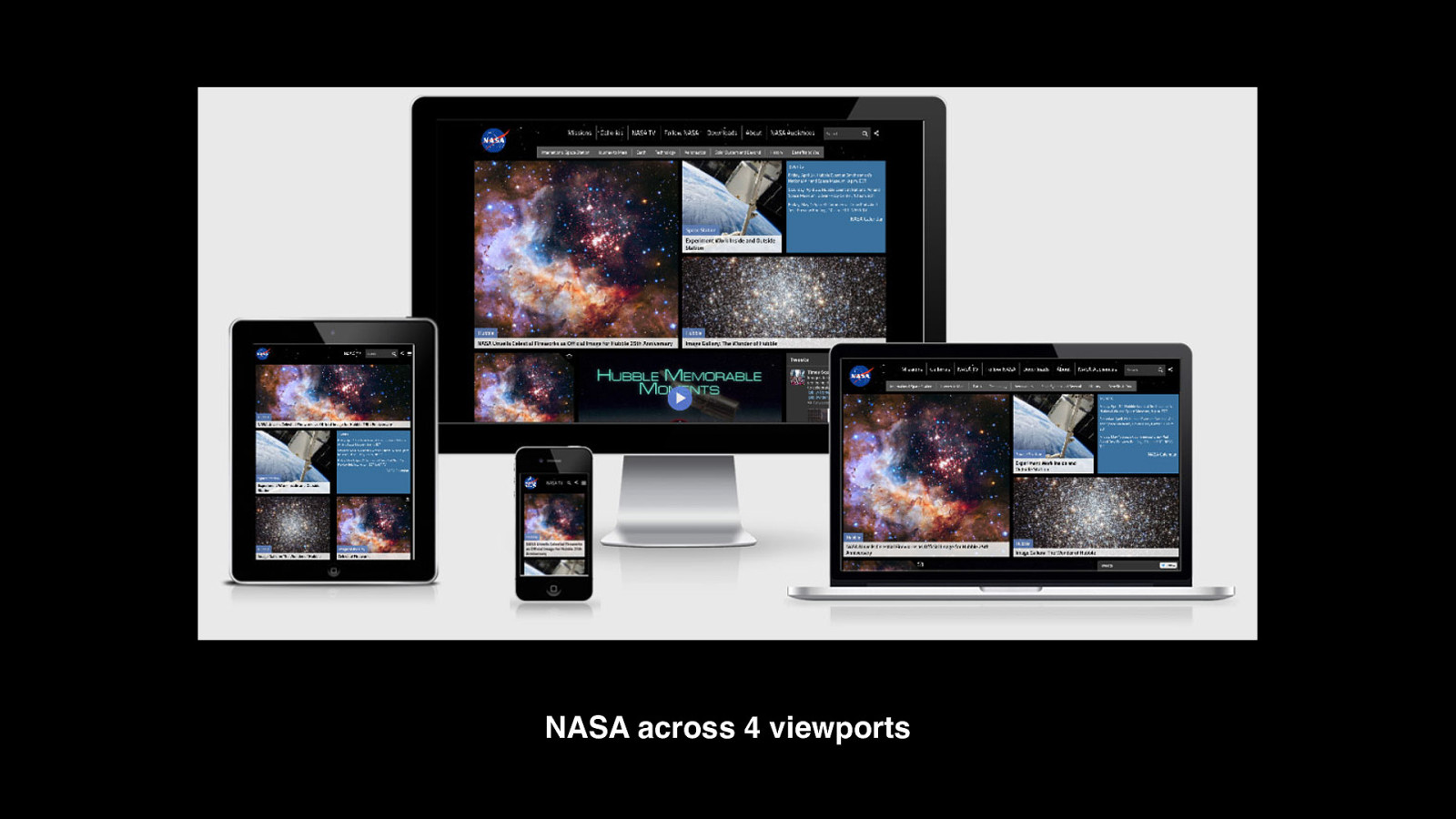
NASA across 4 viewports
Slide 75
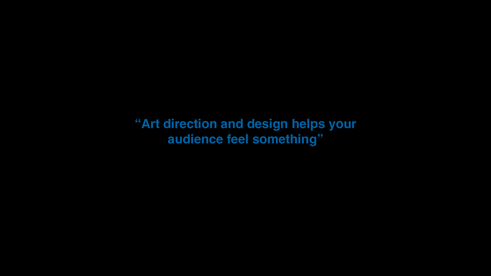
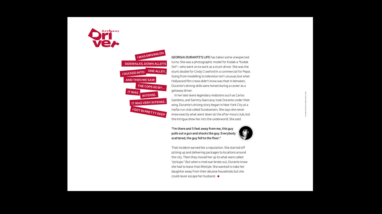
“Art direction and design helps your audience feel something”
Slide 76
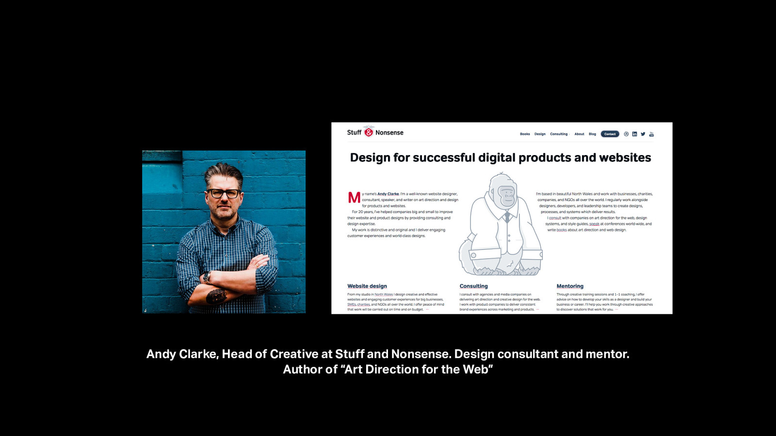
Andy Clarke, Head of Creative at Stuff and Nonsense. Design consultant and mentor. Author of “Art Direction for the Web”
Slide 77
Slide 78
Slide 79
Slide 80
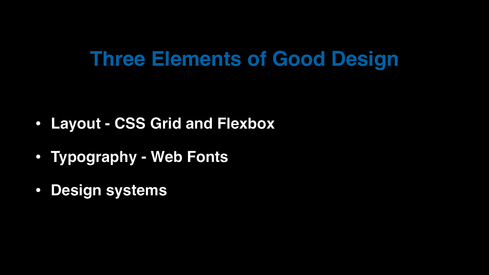
Three Elements of Good Design • Layout - CSS Grid and Flexbox • Typography - Web Fonts • Design systems
Slide 81
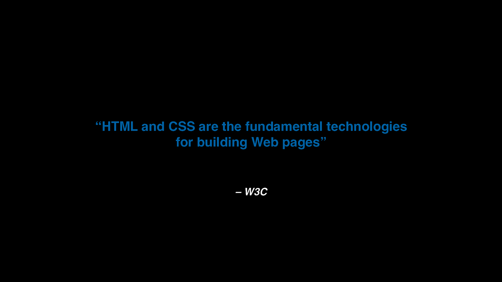
“HTML and CSS are the fundamental technologies for building Web pages” – W3C
Slide 82
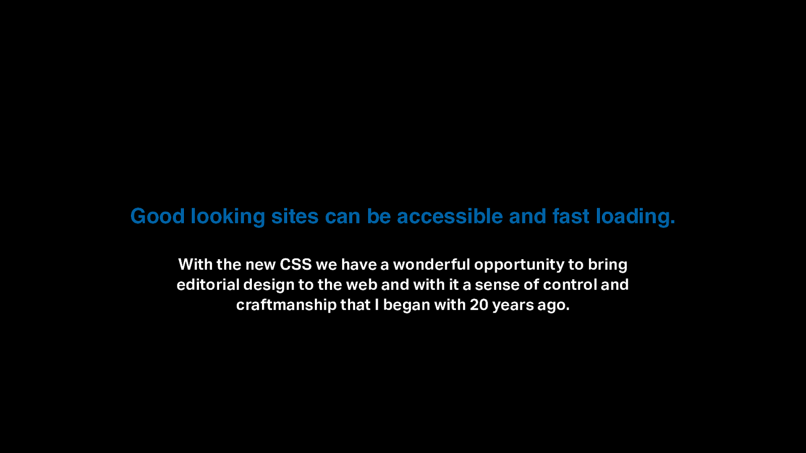
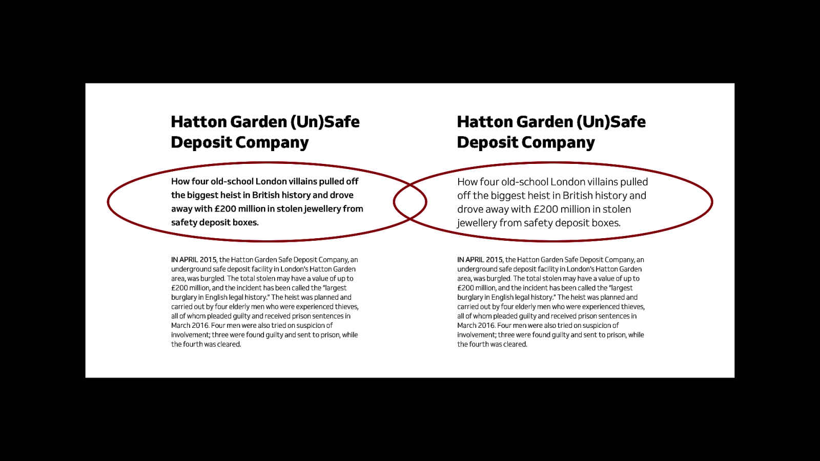
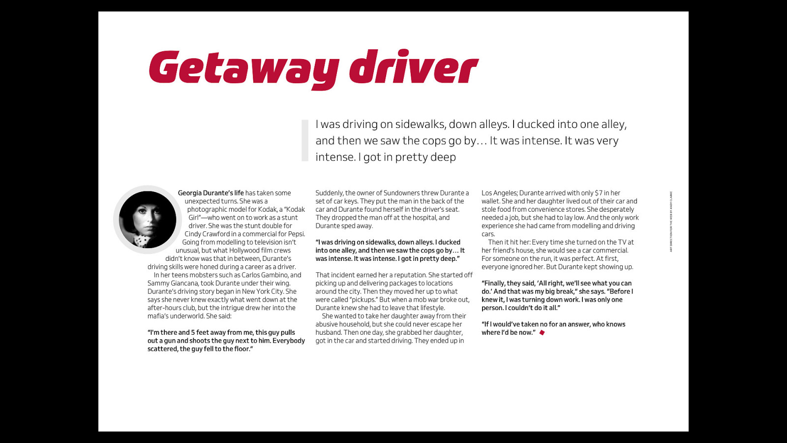
Good looking sites can be accessible and fast loading. With the new CSS we have a wonderful opportunity to bring editorial design to the web and with it a sense of control and craftmanship that I began with 20 years ago.
Slide 83
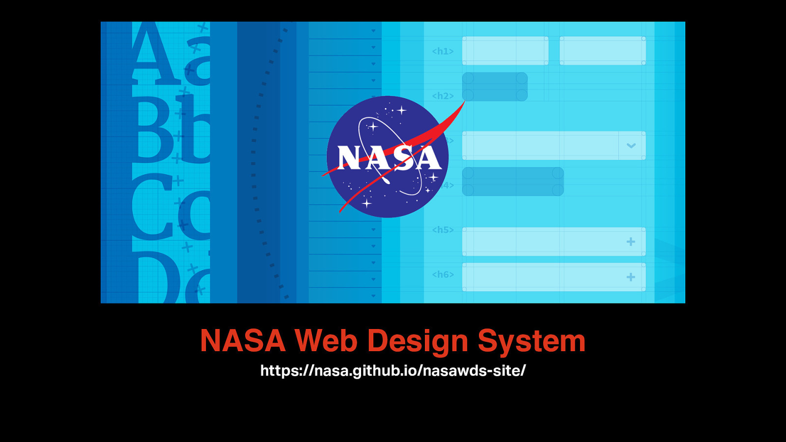
NASA Web Design System https://nasa.github.io/nasawds-site/
Slide 84
My design principles Accessibility, Performance and Aesthetics
Slide 85
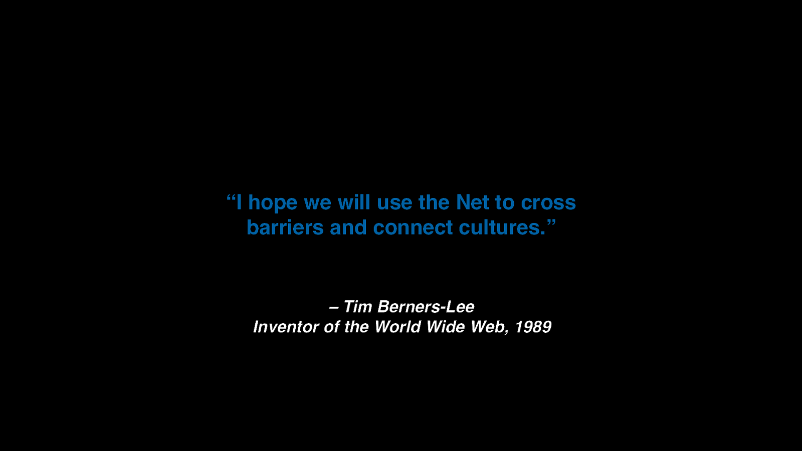
“I hope we will use the Net to cross barriers and connect cultures.” – Tim Berners-Lee Inventor of the World Wide Web, 1989
Slide 86
Thank You. https://speaking.scottgruber.me Creative Commons Attributions: Slides 5, 24, 25, 26, 28, 29, 30, 31 made by Brad Frost for Responsive Field Day 2015. Rachel Andrew's photo by Drew McLellan.